


Oil pastel paintings are (for me, for now) faster than watercolours, so are the ideal…
Ullapool
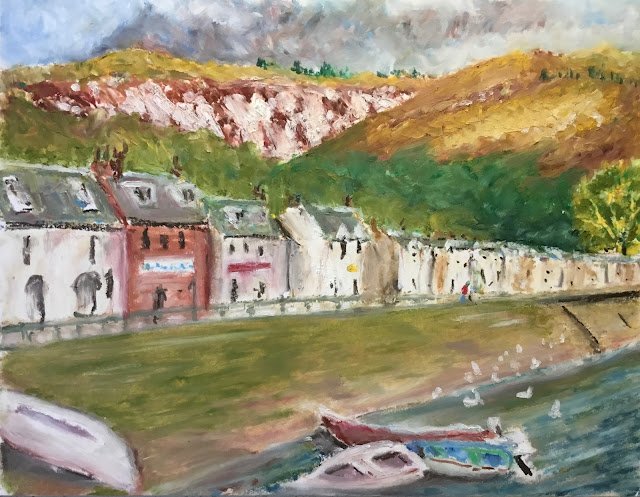
I fancied giving the oil pastels a go today and this is what I came up with. It’s a view of Ullapool, a tiny town somewhere on the West Coast of Scotland farther North than Inverness. It’s a great place to stay if you want somewhere off the beaten track and like walking in the hills or taking boat trips out to islands. There’s good beer at the Ferryboat Inn and I expect the local fish suppers are good.
The big attraction with this view was the range of shapes. There’s so much there to get excited about. What I did was work my way down the painting one major shape at a time, using the three colour rule almost everywhere. That means dabbing in at least three different colours everywhere before weather leaving them, mixing with fingers or dabbers or kind of blending with the final pastel.
The places where I had the most fun were the whites in the houses and the boats. I managed to work other colours in to get some cracking impressionistic tones. It’s already looking like my white pastel will be the first one that needs replacing: there’s already only half of it left. I wonder if Sennelier produce white multipacks? Anyway, the impressionistic colours didn’t stop there, with some amazing pinks in the sea wall. The sea is good too.
The houses have come out OK, looking like they’ve been painted in oils. My rough dabs with the burnt sienna for doors and windows are absolutely fine but I was a little frustrated with the attic windows where the pastels didn’t allow me to draw as accurately as I’d have liked.
I acted on a tip I picked up on Landscape Artist Of The Year last night, from a Paul Whitehouse painting. The second house from the left (I think it’s a chippy) stands out from the rest with its red/orange colour. To help it fit in with the rest of the painting and get a bit of balance, I used a similar colour in one of the boats and added a guy in a red jumper staring over the railings.
I was going to say that the perspective in this one was good but then I saw that the gutter lines on the two houses on the left were a bit too horizontal, so I’ve just gone over then with the burnt sienna at a different angle.
The worst thing about this one is the way that one of the green tree shapes doesn’t stand out. The tree on the right is fine. So are the light trees behind the houses. The problem is the darker trees on the right behind the light trees and the hill. The edges between these trees and the light ones and between these trees and the hill aren’t sharp enough for my liking. I had lots of goes at using white to lighten the colour on one side of the edge but without any success. Oh well.
If this was a watercolour, I’d be wondering whether the focus of the painting was the boats, the blouses,the guy in red or the hills. The boats and the hill on the left seem to be the most in focus, so maybe it,s one of them. It’s more likely the boats, so maybe the hill on the left needed blurring and softening.
Overall though, yeah, I think this works. It’s going up for sale. To see the price, click here.
Leave a Reply