


After three days off watching the chess at the FIDE Candidates, I was back in…
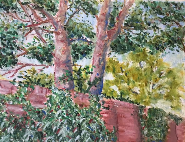
Two Trees, Hartlip House
After a flop with the watercolours, I’m back to the oil pastels again, where everything always seems to go well and I can regain some confidence.
This is a view over the wall into the garden of Hartlip House from a footpath that leads from the Lower Hartlip Road up to the church. I’ve already painted the bottom of the footpath and the front of Hartlip House where the footpath emerges. Honestly, this village is covered in great painting material. And the idea was that this one might give me a chance to give all the greens in my collection a runout.
I didn’t put down any pencil outlines today or divide the paper into squares. Instead I just put down some outlines using light English red, a pinkish oil pastel. Then, in order, I filled in the sky, the yellowish background trees, the darker overhead branches, the boughs and branches, the brickwork and the ivy. I scraped out a few lines to add texture to the brickwork.
Delft blue and deep red are officially my favourite two oil pastel colours. They’re going to appear on all my oil pastel paintings and I expect they’ll end up defining my signature style. I used them a lot in the boughs of the tree and the branches and later added a bit of them to the ivy and to the overhead branches as I wanted them to crop up all over the place. Despite using these two colours and various others, the trees came out looking pink, probably as an after effect of my choice of outlining colour. Even though the boughs in my source photo had a greenish tinge, I quite like the pink look. It gives the painting what Ted Keller calls “wall presence”. It’s what paintings need to look good on walls and to sell.
There was a fair bit of tinkering at the end, all of it on the overhead foliage and the ivy. The overhead foliage was looking too light compared to the rest of the painting. To be honest, if I’d not darkened it, the painting would have suffered from a lack of dark values. While the foliage was initially dabbed and then mixed with finger tips, a lot of the darkening was just dabbed on and left. The ivy started as lots of multicoloured spots (most of them in shades of green) that had been individually smudged rather than mixed together. It didn’t look right, so I smudged it using oil pastel strokes over the top that flopped downwards like leaves. There are white and red marks smudging down and to the left and blue and sap green marks sloping down and to the right. The marks are bigger at the bottom of the wall than at the top. The texture of the foliage and ivy both need up looking good while not distracting from the boughs of the trees who remain the stars of the show.
This one’s definitely a success. By making the ivy leaves bigger at the bottom and by tapering the bough of the tree on the left, I’ve ended up making this look like a worm’s eye view. Both of these features were deliberate but their impact was a happy accident, ending up more extreme than I expected.
This painting was donated as a raffle prize to raise money for Hartlip Church. It was won by a former landlady of The Rose & Crown. She was married to a highly talented artist so already had a houseful of paintings. She donated this one to the hospice where her husband spent his final days and it now sits proudly in a wall there. RIP Roger.
Leave a Reply