


I've been meaning for a couple of weeks to head out and do some plein…
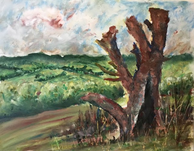
Tree Looking Over Queendown Warren
Hello there, and a big hello if you’re here trying to decide whether to invite me into one of the pods for Landscape Artist Of The Year. The competition closes to entries on Monday so I’m hoping/expecting that judges will be checking out this website some time soon. If you’re one of those judges, you can click on one of the words in the word cloud at the top of the page of you want to filter posts. I’d suggest landscapes, oil pastels or personal favourites.
Anyway, it’s an oil pastel landscape today. My LAOTY submissions were all oil pastel Landscapes and if I make it into a pod, I’ll be bringing the oil pastels along. The subject matter today is a dead tree in Queendown Warren where I go for my daily four mile walks. The tree has a great view over the valley and I thought this particular shot of the tree made for a great composition.
The big challenge I set myself today was to make the sky, background, foreground and tree all distinct from each other. Something that’s easy enough to achieve in watercolour by varying the water content but oil pastels? That’s another matter. I did the painting one plane at a time and thing I did manage to get the distinction I was after. So it was sky first, very light with the colour, using the edges and not the ends of the pastels, adding lots of white, then smoothing things out with a finger. Next was the background up to the horizon. I’m really pleased with how this turned out. The hedge/tree borders between fields worked out well and you can see in the fields where I’ve tried to sculpt the landscape while smoothing out with my fingers. The foreground trees were more tricky. It took a lot of attempts to get to where I finally ended up but I’m reasonably happy. When smoothing the colour out, there was a very fine line between oversmoothing with no texture and scraping around leaving too much texture. I got there in the end, with just enough texture to distinguish the trees from both the hills beyond and the big tree at the front. Then came the hillside, the tree and the bit in front of the tree. For the first and third of those, a lot of it was just a case of putting down random, mainly green, colours and smoothing them downhill, then adding some random colours, mainly brown, in places for foliage and sweeping it up in places. But let’s talk about the tree.
Actually, there’s not much to say about the tree, come to think of it. I put down loads of random colours, generally darker in the darker places and lighter in the lightest places and the highlights. And then I smoothed it all out with one of those rubber tools, trying to get hard edges around the outside of the tree, while also sculpting the tree with curved lines around the trunk and branches. After I’d done this, I tried adding and smoothing in more colours where I thought the tree wasn’t colourful enough.
Once the tree was done, I filled in the bit of land in front of it and scraped out loads of grass, which showed off all sorts of colours that were waiting underneath. And that was me done.
Let me say first of all, this one’s good enough to go in the shop window. To see the price, click here. The highlights for me are the distinction between the layers, the sculpting of the tree and the colourful grasses. The only thing I’m less than 100% happy about (and others may well disagree with me) are the colours. It’s all a bit blue sky, green grass, brown tree with any impressionistic colours being a lot more understated than is normally the case with my artwork. I can see some of the (pinkish) light English red in the tree but my other two signature colours, delft blue and deep red, have gone missing.
Anyway, onwards and upwards. Might have to keep going with the oil pastels for the next week or two.
Leave a Reply