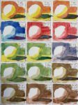
I discovered something new today, thanks to Liron Yankonsky's YouTube channel. It's the Artist Assist…

Tracey
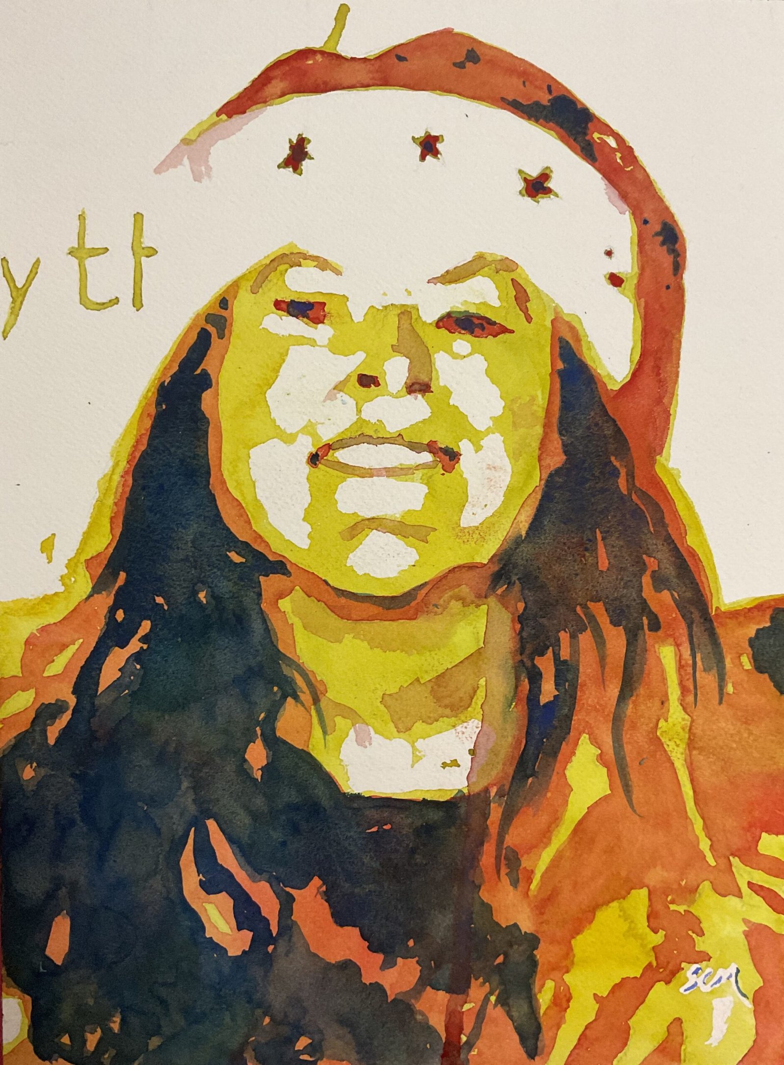
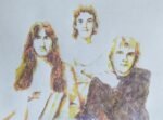
This is Tracey, a friend of the family. She dabbles in painting herself and gave us. Painting of our dog Ruby last Christmas and it’s been at the back of my mind all year that I really should do a painting for her this year. The problem was that I couldn’t find a photo of her, her dogs or her family anywhere so had nothing to go on. Then yesterday, I found a photo of Tracey, the wife and a couple of others taken in some hospitality room just before a concert at the O2. So I took a sneaky photo of the photo on the iPad.
I wanted to paint this one in three layered glazes using the Artist Assist App but it took me a while to get things working. There wasn’t enough variation in the photo between different values, so I converted it into black and white and increased the contrast to the maximum. But there was too much dark tone in there, so I brightened it. But then there was too much light tone, so I darkened it a bit. By using a binary chop method I eventually got to a photo that would come out the other end of the app with proportions of different values that I was happy with.
I’d already decided to use yellow as the light glaze, red as the middle glaze and blue as the darkest glaze. I picked transparent yellow as it was a staining colour, so great for glazing over. Then it was Winsor red, another stainer. The blue on top didn’t need to be staining and nothing was going to be painted over it, and I picked French ultramarine as it looked better in my swatches than Winsor blue green shade, which was the other blue that I considered. No other colours were used today and this is in the key of triadic right.
Methodology–wise, it was case of keeping faith with the process, so I:
– put down pencil outlines using a grid, as usual
– masked the areas that the app was telling me to leave white
– painted yellow over all the ares that the app recommended, not questioning anything, even when things felt a bit weird in places
– printed red all over the recommended mid–tone areas
– rubbed off the masking fluid
– painted blue over the recommended shadow areas
And at the end of this I somehow ended up with a good portrait. I did do a tiny bit of tinkering at the end though:
– I had to add a bit of red over the left side if Tracey’s neck as I’d made it a bit too wide
– I added some very dilute red to bring out the eyebrows and the side of the nose
– I added some more shadows on Tracey’s right side, trying to make them look more like strands of hair
And that was me done.
This came out really well and felt really easy. It looks strange close up but from a distance, it’s definitely Tracey, in personality as well as likeness. I like the Santa hat too, and how the bottom right of the painting looks like flames. Tracey will be getting this for Christmas.


Leave a Reply