Back to the artwork after a few days off, and this is looking like an…

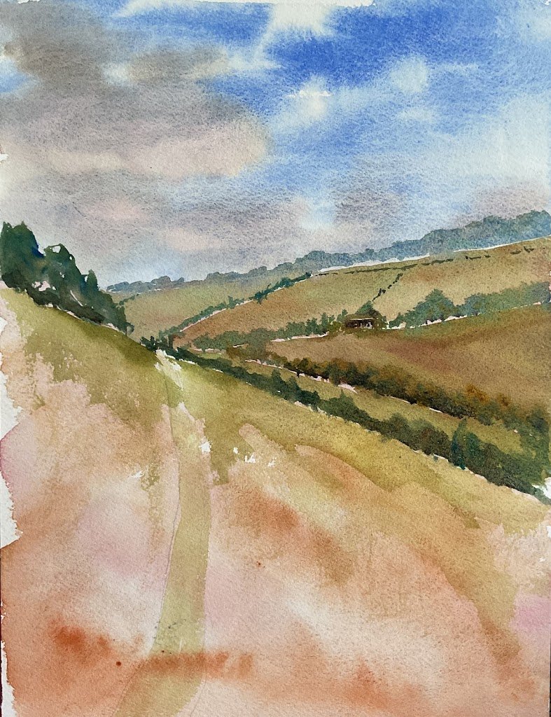
Towards Warren Cottage
I’ve caught up on my sleep now and can finally complete my three watercolours in three days challenge, two days late. The challenge for the third painting was greenery, so I picked one of the many the many photos I’ve taken in my daily walks across Queendown Warren.
There are five colours in there today: French ultramarine. Transparent yellow, quinacridone magenta, burnt sienna and viridian. I can,t really allocate a colour key to this one with a green playing quite a prominent role as well as there being both a warm and a cool red in there.
I was dreaming about this painting last night and, in this dream, I’d put down an underpainting using the brown and the magenta and then painted everything else over the top. This included painting clouds in brown and magenta and later glazing the blue over the top to make the clouds grey and purple. A quick experiment before starting this morning told me that this wouldn’t work, so I painted a more conventional sky in the blue, leaving white gaps. I dropped in a grey mixed from the blue and brown and then a little of the magenta into the grey in a couple of places. It I did underpaint everything else with the magenta and the brown, using the cooler magenta for the more distant hills. And I took a photo of how things looked at this stage:
Interesting, yeah?
After that, I painted in the shapes from the back to the front, mixing interesting greens in the palette from all five colours, painting them in and then dropping in individual colours wet into wet for variety.
And I kept doing this, eventually being faced with the problem of the big shape in the foreground. I started by putting a bright, yellowy green along the horizon to attract eye. A good start. But then Don’t Answer Me by the Alan Parsons Project came on and I had to stand up and move about. And when I did this and turned back to the painting I was shocked by how good the foreground looked. If I added anything else to the painting it would only make things worse. I don’t care if this looks unfinished; that was me done.
This feels like a big success and has given me a big confidence boost at just the right time of year. It’s always tempting with landscapes to paint the background, middleground and foreground all in detail, confusing the viewer. There’s no confusion here though – there’s no foreground and the viewer is left in no doubt that he should be looking at the background. That’s what gives this one a huge sense of space.
This one was put on display at the Rose And Crown and sold to a former local visiting from Australia.


Leave a Reply