


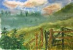
Just the one oil pastel piece today. When I was out exploring Queendown Warren the…
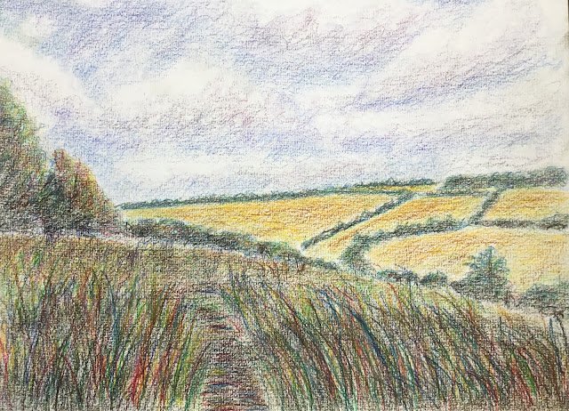
Towards Stockbury From Queendown Warren
Back to the artwork after a few days off, and this is looking like an understated return but there are few things that I tried out in this one, with varying degrees of success:
– I picked a simple view for a change, with big simple shapes, just to see what I could do with it
– I thought about what it was about this view that made me want to paint it. It was the bright yellow colours in the fields in the other side of the valley, so I made sure these were emphasised
– I used two source photos: one for the terrain and a separate one for the sky
– I tried to indicate the slope of the yellow fields by applying strokes of burnt sienna along flat contours and along maximum gradient contours
– I tried to use a lot more blue and yellow and less green than normal, especially within the trees
– I tried to get a lot of texture into the foreground with those big grassy strokes
– I tried to make the foreground more interesting by dividing it into strips with diagonal borders
Of these, it’s only really the dividing up of the foreground that didn’t really come through, otherwise I’m pretty pleased about how these experiments worked out. From a distance, and without glasses, this looks pretty good. The colours in the sky, the yellow fields and the grasses are all great. Take a close look at the grass and you’ll see where I’ve tried to fill in some of the gaps with dark sepia. Where the painting could be better is along the bottom – underneath all those foreground grasses there’s no undulation in the terrain, it’s all a bit flat and boring.
Still, this was good enough to go in the shop window. It was on display at the Rose & Crown for a while before being sold to someone local. If the buyer is who I think it is, she’s told me that this painting reminds her of the rides she used to take on her horse over those hills in the background.
Leave a Reply