


With the whole day available for painting today, I've finally completed a watercolour in the…
Thurnham Castle
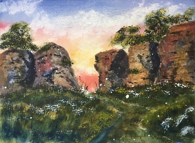
Today I’ve been on a day trip to paint Thurnham Castle. It’s a little bit to the North of Maidstone and is just a pair of hills, one of which has some ruins on top of it. It’s actually a quiet place with very few visitors: I saw three people in three hours.
After having a good walk around, I picked this view. If I’d known how I was going to be plagued by ants and midges I might have chosen somewhere else. It wasn’t a great day generally with me also slipping up somewhere and putting my hand out on front of me to save myself and finding it in a huge patch of nettles. It was also threatening to rain all afternoon, so I had to be ready at all times to run for cover under the trees.
For the main three colours today, I picked French ultramarine, Winsor red and Indian yellow. I needed to force myself to give the cerulean blue, rose dore and transparent yellow a break. So this is in the key of orange warm. Not much thought was put into this apart from wanting to have a granulating blue in the squad. Green apatite genuine, cadmium red, cadmium yellow and titanium white all make appearances, as is pretty normal at the moment, and there are brief appearances for Mayan blue and hematite violet genuine. And burnt sienna gets an extended outing.
After drawing some rough shapes and spattering over some masking fluid, generally avoiding the sky, I started painting. The sky is always the first thing to be painted and my choice of three colours suggested a sunset. From top to bottom there are bands of my blue, red, yellow and red. The first band of red is there to keep the blue and yellow separate so that no greens appear in the sky. I dabbed out a few clouds with kitchen roll.
Then the ruins. These took a while to get right. I started with a fairly random wash of my yellow, blue and red, generally veering towards yellow where I wanted highlights and blue where I wanted shadows. I also dropped in some salt for texture. That was enough colour for the ruins: all subsequent layers were about toning down the colour. The second wash was mainly that grey that you get from French ultramarine and burnt sienna but variegated slightly in places by introducing the the yellow or red to the mix or increasing the amount of blue. Again I threw on some salt. I dabbed in the odd bit of titanium white here and there to indicate the lighter flint stones in the wall but this didn’t really work, so I softened them and dabbed them out where possible. The wall was still looking wrong and I was beginning to think this would be another failed painting.
For the third wash, I thought about using hematite violet genuine to neutralise the colour even more and to add some texture but thought this might make the walls look dirty. So my mind turned to mixing another colour with the hematite violet to make the other colour granulate. Looking at the wall and my painting, I thought my painting wasn’t white enough, so went against all my principles on the use of white and mixed it with the hematite violet to get a grey that may have had a bit of granulation potential. I’d almost written the painting off at this point, so was ready to press the nuclear button. When I painted on this grey, it became clear that it was too opaque to be of use, hiding all those primaries that I’d worked so hard to put underneath. But I found that if I painted the shapes one at a time, then dabbed the opaque grey with a kitchen towel, I got something presentable. This was a huge shock!
As a final step in the ruins, I mixed my three primaries into something close to a black and added some big shadows, some dark stones and some shadows under stones.
While waiting for individual washes on the ruins to dry, I worked on the foliage. Behind the walls I stabbed in leafy tree shapes with green apatite genuine, highlights with cadmium yellow and a get barely visible cadmium red bits. I’ve been doing this a lot lately but it works so well.
For the foreground foliage, I started with a very loose underpainting of French ultramarime, Mayan blue, and Indian yellow. Later I covered this by flicking up some grasses using the Terry Harrison Merlin brush (again being used a lot at the moment) and either green apatite genuine, French ultramarine or Indian yellow as the mood took me. I added a bit of foliage on the ruins. And then dabbed in bits of cadmium yellow, cadmium red and titanium white where I thought they would improve the painting. This gives a very different effect to just spattering those colours at the end.
The last thing I did, after I’d cleared all the bugs out of my bags and almost packed everything away, was to rub off the masking fluid. Job done.
And this one is a big success. The ruins aren’t the same colour as those in reality but I don’t care. The red at the bottom of the sky is a bit dark and could be a distant hill but I don’t care. In reality there aren’t trees behind the ruins when viewed from this angle but I don’t care. Some of the white spots under the masking fluid are a bit big but I don’t care. I’m proud of this one. The colours in the walls are great and everything fits together, despite the green apatite genuine only being in the greenery and not in the walls – I think it may be the French ultramarine and the Indian yellow in the underpainting and in the upward grassy flicks that are responsible for this.
This one is up for sale. To see the price, click here.
Leave a Reply