


Something about that Joe Jordan painting yesterday put me in a nostalgic mood and wanting…
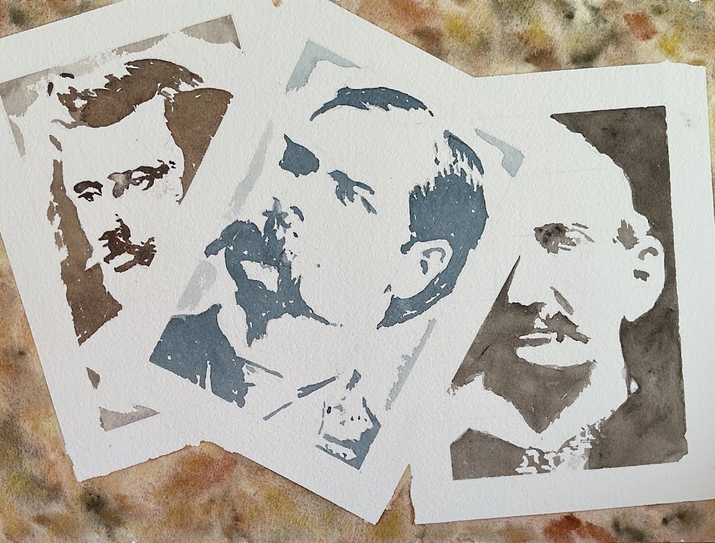
Three Famous Gunslingers
<Edit: The day after I painted and posted this one I found that I’d screwed up. The guy on the right is Frank James, not Virgil Earp. That makes this painting a failure and I’ve taken it down from the shop window. I’ll have to have another go at the Earps another day.>
It’s still LAOTY preparation season and I’m getting plenty of practice at landscapes but I can’t starve myself of portraits for long. So I was back on the portraits today and binged out on a triple portrait.
I’m currently reading Doc by Maria Daria Russell, a fictionalised biography of Doc Holliday. It stops short of the gunfight at the OK Corral but I’m getting to hear plenty about the Earp brothers. To help me put faces to names, I was googling all these historic characters last night and looking at some very old portraits. And once I’d seen the portraits, I decided I had to paint them. And this painting depicts the real life characters, not actors in a film.
It didn’t take me long to plan this one as a set of four faded photos against a desert background. What else could I have done? I was planning on painting all three in sepia but decided at the last minute to use three different faded looking colours. Morgan on the left was painted with a mix of burnt umber and French ultramarine, Wyatt in the middle is in Payne’s grey and Virgil on the right is in sepia. A long overdue starring role for burnt umber, Payne’s grey and sepia, the loyal squad players in a palette of colourful superstars. The background was painted using the desert supergranulators: a random wet into wet mix of the yellow, orange, brown and grey.
The painting was prepared with pencil grids, masking tape for frames and masking fluid for some fine detail in the eyes. I used the Notanizer app to plan my values, starting with a single value plan (highlights and darks) with the bars set at points where a single value would be enough to achieve a likeness. As an insurance plan, I also looked for second bars at which I could divide the highlights into lights and whites and noted this down. After I’d put down all the darks, I was happy so didn’t bother with a second, more watery, lighter layer of colour to improve the likenesses. I did, though, add watery colour around some of the edges to distinguish the photos from their white borders.
I would say that this painting came out exactly how I’d imagined it but that wouldn’t be right. If you look at the bottom of Morgan’s photo or the top right of Virgil’s, you’ll see the masking tape hasn’t quite done its job properly. There are some jagged edges there that were supposed to be straight. But they’ve actually improved things, making the photos look even older. I can’t find fault with this one me it’s not often I say that. It’s up for sale.
And you can expect to see portraits of Doc Holliday, Jesse James and Billy The Kid at some point.

Leave a Reply