


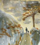
There's been a bit of snow overnight so I thought I'd have a go at…
Three Days Of Snow
Back to painting again today and, for reasons that will become apparent, I wanted to get in some practice at snow paintings. So I looked through the Ron Hazell and Zoltan Szabo books for inspiration and came up with three ideas to try out. Those two books, by the way, are great as reference works when you want to look for something specific.
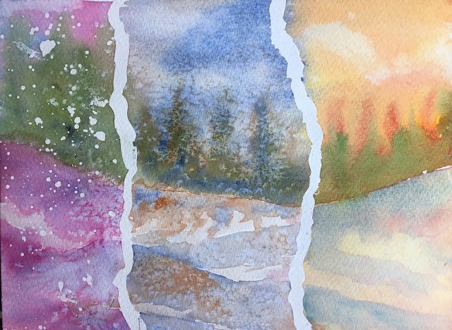
I wanted to try out all three ideas, so decided to divide the paper into three. Rather than using a ruler and masking tape, though, I just decided to mark out a couple of ragged divisions with masking fluid. Quite a smart move as those jagged lines seem to make everything feel colder. I also allowed a bit of leakage to spill over between adjacent paintings, which I’m quite pleased with. It makes the viewer wonder whether this really is three separate paintings or a single painting with two jagged white lines obscuring most of the transitions. Anyway, let’s go through the three sub paintings.
First, the one on the left. The snow was created using masking fluid, although I’ve also allowed some salt from next door to spill over. The sky and snow a made from cerulean blue and permanent rose. The trees use those two colours plus olive green and sap green (from the experimental palette, making their debuts). I like the foreground and falling snow on this one but the green trees are a bit too jarring and complementary – in retrospect they’d probably have looked a lot better in a blue/purple colour. Maybe next time.
In the middle, the sky and foreground use those old favourites French ultramarine and burnt sienna. The trees use those same two colours plus the olive and sap greens. The falling snow was made by sprinkling on salt. I followed Zoltan Szabo’s advice and only added the salt just as the paint started to lose its shine. The effort put into getting the timing right was worth it. These colours granulate really well too, which increases the impact of the salt. I like the trees more on this one, even though the original idea was to have them in a more neutral colour with only a hint of green in the mix. The weakest bit about this on is the hard edges along the bottom of of the shadows on the drifts. The tops of the shadows are hard but the bottom edges need to be soft.
And then there’s the third one. A much warmer day, using some Zoltan Szabo ideas. The sky is warm, using rose dore and Indian yellow. The trees use those two colours plus cerulean blue and the olive and sap greens. The foreground started with cerulean blue and rose dore all over. The idea was to leave it to dry, dab out light areas and glaze over with a warm colour. But, of course, rose dore is staining and as soon as remembered this I dabbed out the light areas. Finally I glazed over the foreground with a very thin layer of Indian yellow. And this is what I ended up with. I think it works. The granulation of the cerulean blue just below the tree line is great.
Overall, I’m definitely happy with this one. And it’s been sold.
Leave a Reply