


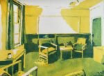
Back to Christ's College tidy for another indoor landscape. This is a room in…

Third Stone From The Sun
It was too hot yesterday to be outside painting. So I spent the day indoors watching YouTube videos of people swatching the colours from the super granulating Schmincke collections. There are six sets of five colours: galaxy, glacier, tundra, forest, under sea and shire, although the tubes can all be bought separately. My favourite is the tundra set, and the tundra pink and tundra violet colours in particular. But looking at these colours a bit deeper, they all seem to be convenience mixes. Tundra pink, for example, is just a mixture of French ultramarine and Potter’s pink. Tundra violet is French ultramarine with Mars brown. So I ended up spending a lot of the day wondering whether I should put the tundra set on my wishlist. Or just the tundra pink and tundra violet. Or Potter’s pink and Mars brown. If I went for the set, I’d probably keep them in a separate palette but if I went for two colours, could I add them to my 18-colour palette, and, if so, what colours would be dropped?
In the end, I didn’t add anything to my wishlist but decided that I’d give my three Daniel Smith PrimaTek colours a serious workout, testing their granulating abilities both on their own and when mixed together. I identified 24 swatches that I wanted to try out, divided up the paper and put the swatches down. I think the trick with these is to start around the edges with a slightly watery mix, put water on any white space for the paint to move into, dab a little bit off and stab in some drier paint along the top. I may have been using these colours wrongly by not making them watery enough and by mixing them on the paper rather than in the palette. I ended up with twenty standing rocks, although I’ve seen people on YouTube painting pebbles and planets while doing this sort of exercise.
The final set of 24 swatches looks quite good but won’t be put up for sale because a picture frame would crop off too much around the edges. Anyway, the main point of this exercise was to experiment with those PrimaTek colours, so I’m going to go through the swatches one by one. I’ve taken separate close up photos of these so that they show up all the granulation. This means some of them are partly in shadow but that’s a small price to pay. Anyway, here we go:

First up is hematite violet genuine. I’ve definitely been laying this on too thickly in the past. With a bit more water, this really is pink paint with black spots and great for trees and rocks. But how does it mix with other colours?

Hematite violet with viridian. I picked viridian because it’s already a granulator on its own. Lots of background forestry texture and the garishness of the green has been toned down a bit.

Hematite violet genuine with green apatite genuine makes an amazing granulating greenish grey. I’m not normally into realistic colours but this would be great for wet rocks.

Hematite violet genuine and Prussian blue made for a decent granulating black. Might be useful at some point but I’d prefer to see a bit of colour.

Hematite violet genuine and cerulean blue make a gently granulating blue grey with the odd glimpse of red. Another interesting one.

This is hematite violet genuine and French ultramarine. I had high hopes for this one as French ultramarine is a granulator that’s used in both the tundra pink and tundra violet. I like this one. It’s another granulating black but this time there are pinks, blues, reds and violets peeking through.

Hematite violet genuine and quinacridone magenta. I’m not keen on this one. It just looks like a dirty application of the quinacridone magenta and I can’t imagine ever wanting to use this mix for anything. First so far that I’ve been unhappy with.

Hematite violet genuine and rose dore. Rose dore is made up of a yellow and a violet pigment and I was hoping they might show up separately. They don’t. But I still quite like this. Rose dore is an earthier colour than the quinacridone magenta, so the extra texture from the hematite feels like it belongs there.

I thought I’d try adding some cadmium red to the hematite violet genuine as it’s supposed to be a granulator. I ended up with something volcanic looking and where the cadmium has been toned down a bit. Definitely an interesting mix but I’m not sure whether I’ll ever use it.

I’m onto the yellows now. This is hematite violet genuine with Indian yellow. The red in the hematite and orange and yellow in the Indian have given this one an orangey sheen. There are lots of yellows, oranges, browns and blacks competing for attention in there, making for an interesting wash that I really didn’t see coming. This one might suit animals more than rocks.

Mixing hematite violet genuine with transparent yellow produces a mixture that has a lot in common with the last one, with oranges, yellows, browns and blacks competing for attention. But here the orange has been toned down a bit to a more yellowy level. And I’m wondering what those people who spend thousands on slices of toast that come out looking like Jesus would pay for this one.

Hematite violet genuine and raw sienna. Similar to the last one really, except that I may have included less of the hematite in this mix.

That’s enough of the hematite violet genuine for now. Let’s move on to green apatite genuine. Here it is on its own, with little bits of red and black showing through. I need to use a more watered down version of this colour than I have been using to allow it to granulate like this.

Green apatite genuine mixed with Prussian blue is a big disappointment. No granulation anywhere in sight.

Green apatite genuine and French ultramarine. Only a tiny bit of granulation going on, which is a huge disappointment considering how these two colours perform separately.

Green apatite genuine and transparent yellow. At last a colour that doesn’t eliminate all the granulation from the green. This would actually be a decent second green in a painting where the transparent yellow was my main yellow and where I was putting in green apatite genuine for trees. A nice granulating yellowish green along the top of the trees that was consistent with all the other colours in the painting would work a treat.

With green apatite genuine and Indian yellow, it’s a similar story except that the green is more olivey and less sunny as a result of using a warm yellow. So if doing a painting where I’m having trees in green apatite genuine with a bit of yellow, I should base my choice of yellow at the planning stage on whether I want the greenery to look olivey or sunshiney.

This was supposed to be green apatite genuine and raw sienna but I’m wondering whether I screwed up and repeated the hematite violet genuine and raw sienna mix.

And now we’re on to Mayan blue genuine. This is it on its own, and it already shows promise with reds and greens appearing in places within the granulation.

This is the Mayan blue genuine with hematite violet genuine. The hematite is amazing with just about everything, so it’s no surprise to see pinks, blues and greens popping out in this swatch.

Mayan blue genuine and viridian granulates a bit but I can’t help feeling disappointed. No extra colours are popping out in the cracks, maybe because these two colours have too much in common.

Mayan blue genuine and quinacridone magenta produce a purple with some granulation and colour variation. To be honest, that’s just a bonus. I was already pleasantly surprised that what I thought was a cool blue actually produced a violet rather than a dull grey. This is an interesting one.

When mixed with transparent yellow, Mayan blue genuine produces a really nice granulating green with the odd bit of blue showing through. An alternative to green apatite genuine but not a direct replacement as the green apatite has black and reds showing.

And finally here’s Mayan blue genuine and raw sienna. An earthier mix than the last one, with more brown showing through and less blue. This feels closer to green apatite genuine, not that it really matters.
This is probably my longest post ever. Let me wrap it up with some lessons and conclusions:
– to allow granulating paint to do its own thing, I need to make it more watery
– hematite violet genuine gives an amazing texture to everything
– hematite violet genuine produces amazing granulating multicoloured mixes with blues (biggest lesson of the day)
– be careful mixing with hematite violet genuine with reds: it can just make them look dirty
– if painting in trees with green apatite genuine and needing colour variation, add yellow rather than blue because blue sucks all the life out of it
– Mayan blue can actually make purples
– Mayan blue makes interesting granulating greens

Leave a Reply