


I've been busy with another soft pastel landscape today. This is Dinarić Fortress, a 15th…
Then There Was The Hard Times, Then There Was A War
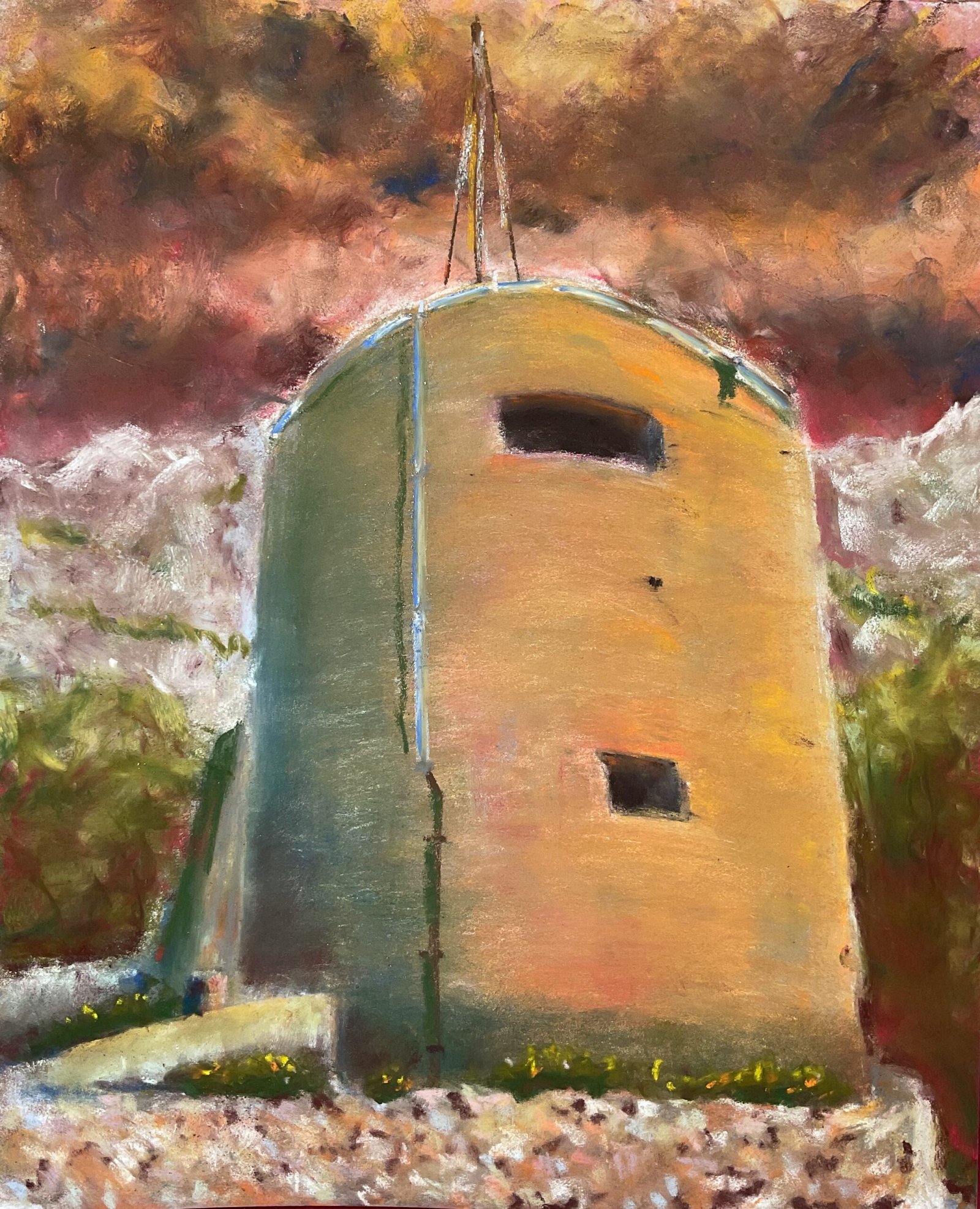
Back to the soft pastel landscapes today. The idea for this one came from LinkedIn where this guy (always the same one, hi Steve) put up a post about WW II pillboxes. Most of these are simple looking buildings in the middle of nowhere, so great source material for the likes of me. With an estimated 6,500 pillboxes still around in the U.K., I’m pretty sure I’ll not run out of material for landscapes during my lifetime. And this one’s not even British! It’s at the Peovica Fortress in Croatia and, although the fort dates back to the 19th century, I believe this building was built by the Italians during World War II.
I started with the sky, putting down my usual warm colours (reds, oranges, yellows, pinks) and swirling them around with a white pastel to blend them. I added the clouds afterwards, using all sorts of colours and blending them with colour shapers. I deliberately made the clouds all point towards the top of the building for dramatic effect.
I wanted lots of colours to be present in the building, so I applied lots of very thin layers of colour. I used. Lot of green and blue in the shadows on the left and lit everything up on the right with oranges and warm yellows. I added some orange inside the top of the window shapes and shadows along the bottom of the building to give the impression of the building being lit up from below. I smoothed out the windows with colour shapers and the outside of the building with a finger wrapped in kitchen paper, being careful to make my finger trace out cylindrical looking marks.
For the hills and greenery down the outside and the background masonry, I threw in whatever colours felt right and smoothed them out with fingers in some places and colour shapers in others. I trued to create strong dark/light contrast between the building and the background but otherwise didn’t think too much about this bit.
And then for the walk at the front, I created stonework with lots of stubby marks with whatever light colours I thought might look good. When the wall ended up looking too light, I added some dark browns between stones in places. And because I wanted to keep individual stones but not have them in focus, I blurred the wall with some stabs with a finger wrapped in kitchen paper.
To finish off, I added the pipework details (too light at first before I darkened them) and a bit of greenery growing behind the walls and suggesting neglect. And that was me done.
It’s not too bad, this one, and worth a place in the shop window. The price can be found here. Somehow I managed to stumble on some great orange/green contrasts. The sky and the wall are both colourful and interesting but, while both go well with the building, I’m not sure that all three belong together. Or maybe the painting needs a tiny dash of purple somewhere to put up token resistance against the other two secondaries?

Leave a Reply