


Today I was feeling inspired by Liron Yankonsky. In a recent video, he created loads…
Then Came The Churches, Then Came The Schools
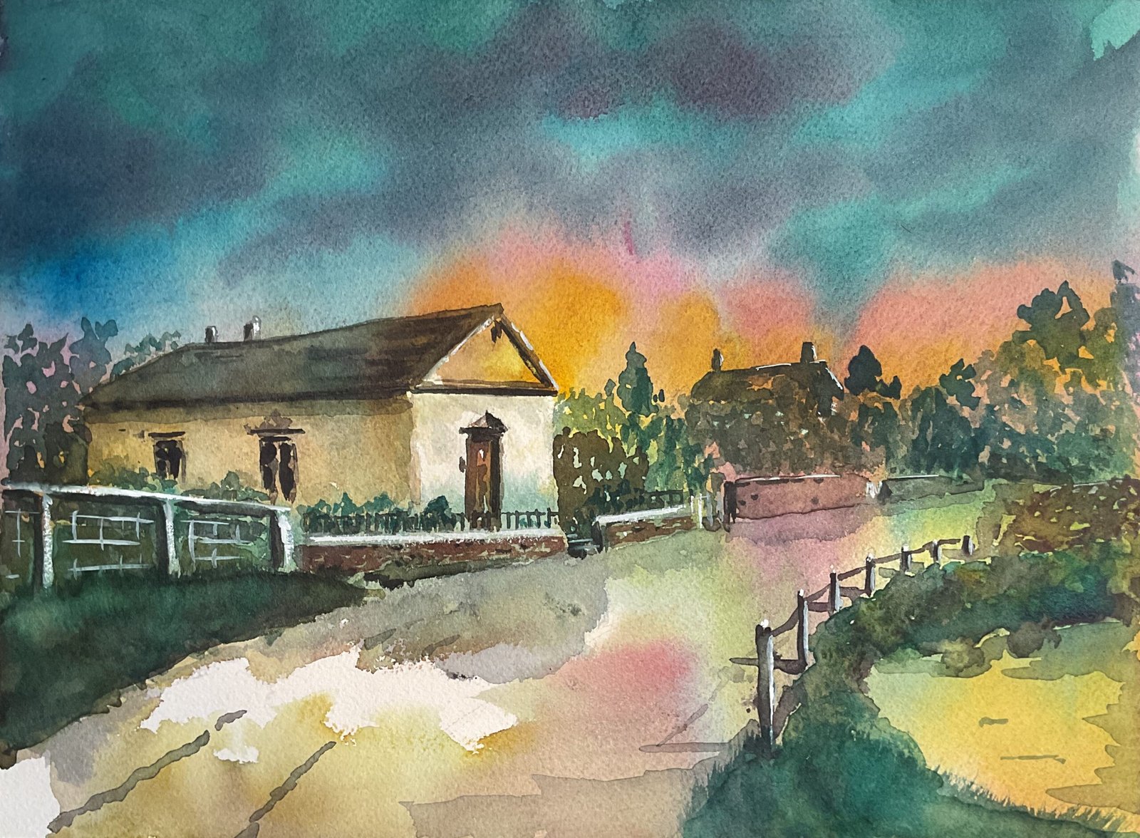
Another watercolour today and, for the first time in ages, it’s not posterised. After doing some YouTubing, I was in the mood to put down a colourful underpainting and to paint some dark neutrals over the top of it to create a landscape. I picked out a view of Hartlip Methodist Church (aka Cardiphonia Methodist Chapel?) and what used to be the village pond from about 1905, a photo that was in black and white and that I thought might help me to think more about values than about colours.
I decided to use just three colours. I was in the mood for Winsor blue (green shade) and quinacrinone magenta and a quick look through my notes told me that using transparent yellow as my third colour would give me the opportunity to mix up some dark blacks, so that was my mind made up and, with cool versions of all three primaries, this painting is in the key of green cool. White gouache would be brought in as a special guest towards the end.
I started by putting down some rough pencil outlines, not using a grid for a change. I then wet the paper thoroughly and mixed up huge watery puddles of all theee primaries. Then I put these on the paper to create my underpainting. I started with blue along the top of the sky, followed by red, then yellow and applied the paint randomly around the rest of the painting, leaving the front of the chapel and some bits of the road white and untouched. I fiddled a bit with the sky, ending up with less red and yellow in there than I’d intended and with some purple clouds. Things came out darker than I was wanting, probably because that blue is so powerful. I always seem to underestimate it.
When the underpainting was dry, I added in darks mixed from the three colours already sitting in what became a very messy palette. I tried (successfully) to stab in tree marks leaving lots of gaps for the underpainting show through and (unsuccessfully) to negatively paint the fence posts on the far left. And then I spent a lot of time fiddling about, trying to create some three dimensionality by adding grassy brushmarks, shadows, reflections in the wet road and white highlights. And eventually I stopped painting.
What I like about this one is:
- the glow in the sky
- the glow in the pond
- the whitish glow along the top of the grassy bank on the left: glow is looking like a common theme
- the way I’ve managed to leave so many gaps in the tree shapes
What’s less than ideal is:
- the perspective on the church looking a bit off
- the sky and the grassy bank on the left being a bit too dark
- not enough colour variety in the trees and around the banks of the pond
- the walls and grassy banks being too differently coloured: a single variegated neutral wash might have worked out better
Still, being a local landscape, I expect this one will be popular, so it’s going up for sale and has joined the queue for the Rose & Crown display. Its price can be found here. All proceeds from this one will be donated to the Methodist church – that’s the way I roll. Oh, and I’m naming it after a line from Telegraph Road.

Leave a Reply