


Time for a new experience. To get some practice in (just in case I make…
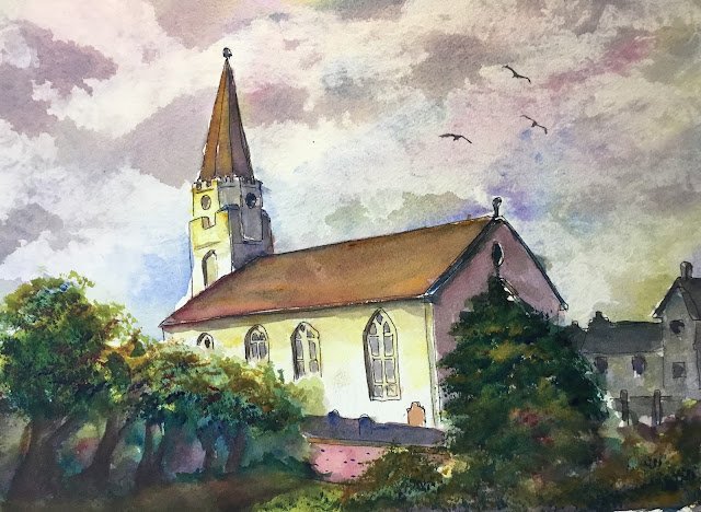
The White Church, Comrie, Perthshire
Painting’s been taking a back seat for a few days while I’ve been enjoying the cricket and the chess. But the test match is over now and it’s a rest day in the FIDE candidates (remember the 2020 FIDE candidates?) so I’ve been back out painting again. This is The White Church at Comrie in Perthshire. Draw a line Northwards from Stirling and Westwards from Perth or Dundee and that’s where you’ll find it. I discovered this church a few days ago while I was googling around for photos of white buildings.
As this was a white building, the colour scheme was a no brainier. I used French ultramarine, transparent yellow and quinacridone magenta. We’re back in the key of purple cool. Only three colours were used in this painting: the were not even any opaques added at the end.
One thing I did differently today was to put down an outline in black marker. I had black markers on the brain for a couple of reasons (i) my birthday’s coming up soon and the kids were talking about buying art gear, so I put a set of markers of various thicknesses on the list along with a case for them a send a couple of books that were line and wash related, and (ii) my painting of Stockbury Church, that I used this technique on a couple of years ago, has attracted a bit of attention this week and might sell.
Apart from he use of a black marker, there’s not much to say about the methodology for this one. I just painted from the back to the front using my three primaries. The sky was dabbed out with kitchen paper as usual. I started the church and foreground with an underpainting. I used a couple of a Terry Harrison brushes fro the foliage. It was necessary to use some red in the greenery to avoid garishness. All stuff you’ve heard before. Let’s move on to the verdict.
Skies always look good when painted in these three colours and today’s was no exception. Even though it’s probably my worst sky to date in this key, it still looks fine. The background buildings on the right have been overworked and are too grey and too dark. This is a bit frustrating as it wasn’t as if I was trying to replicate the actual colours – I’d have been happy with just a monotone light value blue or purple. Then there’s the church. Something’s gone slightly wrong with the perspective: the steeple and classy corners aren’t parallel and the walls in front of the church are tipping downwards too quickly. I can live with the former but those brick walls look odd. In fact, I’ve been a bit too much of a slave to the photo and would have been better off leaving out one or both of the walls. And finallly there’s the foliage. I tinkered too much here and almost wrote off the painting. At first the trees on the left looked good as untextured shapes, but then I had problems painting the big tree on the right consistently with what was on the left. So I reached for the Terry Harrison brushes and tinkered, ending up with a decent looking tree. Which left the trees on the left looking as if they didn’t didn’t. SoI tinkered with them with the Terry Harrison brushes. They don’t look as good as they did before but at least everything hangs together now.
Overall, though, this is good enough to go in the shop window. To see the price, click here.

Leave a Reply