After doing two drawings from the other side of the road opposite the Tuck Inn,…

The Tuck Inn
This afternoon I took a stroll down to the Tuck Inn, my local purveyor of breakfast baguettes with the intention of running off another two or three dash and splashes.
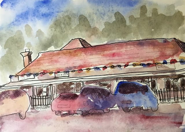
I started with a view of the outside of the building from across the road. It was a deliberate ploy on my part to not include the whole building: I didn’t fancy the alternative of a long thin building with a large empty space above or below it. I deliberately combined most of the cars together into a single shape and didn’t add detail.
When I got home, the iPad recommended these three colours:
A red at last, along with a decent blue and a yellowy brown. It would have been good to get a nice primary yellow to go on the lights and to give a decent green for the trees but beggars can’t be choosers and this is definitely the best set of colours so far.
So I applied those three colours. I actually quite like the muted green that I ended up with for the trees and the way the car colours merge together fits with the looseness of the underlying drawings. I would have preferred a less pink car park though, and I really should start leaving more white areas.
This one was up for sale at one point but I’ve taken it down as I’ve done much better stuff since.


Leave a Reply