


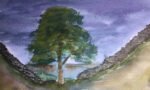
25 June 2018 I'd had some feedback that I was good at painting trees, so…
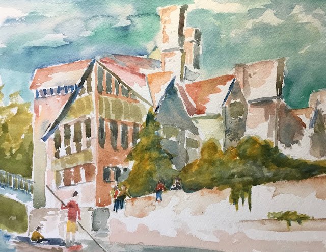
The Trinity Hall Wall
I’ve been rereading Webb On Watercolour and was reminded of the push-pull technique which I never got around to trying out, so I thought I’d give it a go today. The idea is to put down the important bits with hard edges but then soften the marks leaving most of the shape white (but still with that hard edge). If I could do this with lots of bright colours and leave most of the painting white, I’d end up with something pretty special.
I picked out a view of the wall at Trinity Hall, Cambridge. It’s a wall that overlooks the River Cam and is a great place to sit and watch the world go by. My youngest has been offered a place at Trinity Hall (conditional on A level results) and I’m hoping he’ll be able to spend a lot of time on this wall. Painting-wise, the reason for picking this view is that there are so many interesting overlapping shapes.
The three primaries today were Prussian blue, rose dore and Indian yellow, so this is in the key of orange cool. Viridian and burnt sienna are in there too and being almost a cool blue and warm red, they very much fit in with that key.
After sketching everything out in pencil, the only remaining task was to mark edges and fade them out. Maybe also fill in some shapes with variegated washes. So this is what I did.
I’ve ended up with something which, if you catch it out of the corner of your eye, looks a bit like a Frank Webb painting, And there are good variegations and shadows in places. But I’m not happy. Here are the problems, most of which are down to poor execution of Frank’s ideas:
– some cauliflowering in the sky – I’m not sure how this happened
– not enough white space left in the painting
– not enough white edges against the sky
– not enough coloured edges against a white sky
– too many pinky/orange colours. The painting would have looked better with some yellow, blue and red edges. For starters. But I was distracted away by a voice in my head telling me to use realistic colours.
– poor greenage. Maybe I could have made this more abstract, with straight edges or different colours.
So, yeah, feels like a bit of a flop, this one, but it’s going up for sale because it was really popular in a later survey. To see the price, click here.
Leave a Reply