


Another book review and, for the second time in a row, it's a book that…
The Transfer
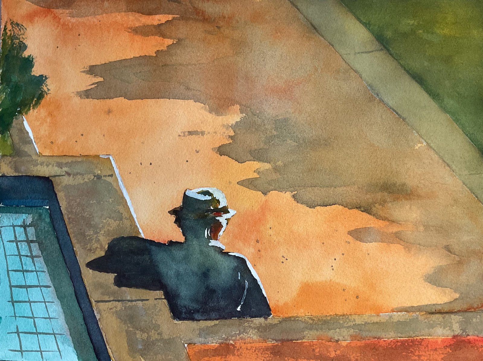
Today’s painting is based on a photo taken by an old friend Olly while (I believe) on holiday in Portugal. He said it had an Edward Hopper feel to it and, from googling Mr Hopper I have to agree. It was a great photo by Olly, with loads of straight lines and interestingly shaped but flatly coloured shapes. The whole composition was just begging to be painted. It reminded me of some of the subjects painted by Shirley Trevena in one of her books, just a load of simple shapes that looked good and might inspire an abstract painting.
That’s not to say this is or was intended to be an abstract painting. I just thought I’d start painting and see where it took me. I started with a pencil drawing. Obviously I used a ruler with all those straight lines. The one change I made at this early stage was to move the top right triangle a bit to the left to make it big enough for the painting to be balanced.
For colours, I looked through my book of swatches and found five or six combinations of primaries where I’d noted down that they produced interesting clashes between orange and green. I chose Winsor blue green shade, Indian yellow and Winsor red because this combination would also give me a very dark neutral colour for the silhouetted figure. Viridian, titanium white and white gouache also ended up being used but because those three primaries dominate proceedings, I’m going to classify this as being in the key of orange cool.
And then I coloured in the shapes one by one. I would say that I worked from back to front but there’s not really a back or front here in what’s a deliberately flat shape-based painting.
For the water in the pool, I mixed some viridian with the blue to get a great turquoise colour that clashes with the orange just as well as the green does.
The kerbs and ledge were painted with a mix of the three primaries but looked a bit too green. I tried to tone this down with a watery layer of titanium white, laid down then dabbed off. It didn’t work that well. Later on I applied a watery version of my silhouette colour and, even later, a dry neutral mix with the edge of the brush. These layers got me to a place where I was happy.
The big orange shape was looking a little boring. I expected this but wasn’t prepared for how boring it was. I tried wetting it all and dropping in more paint to create cauliflowers without any luck, so decided instead to deviate from the source photo and add shadows of some unseen trees out in the right. And those shadows make this painting zing. It’s now a hot sunny day. Oh, and I went over the orange shape along the bottom in a redder orange, just to distinguish it from the lighter orange in the big shape.
The figure is mainly in a black mixed from the three primaries with some blue and red dropped in for variation. For the lit bits on the right of the figure I started with primary colours, trying to replicate the sunlight that I can get on white buildings but things just didn’t look right. So I put in more of the black, allowing it to mix with the primaries. And when it was dry I added highlights in white gouache, not just on the figure but on all the right facing ledges. At some point here, the figure’s head moved from facing away from us to facing to the right, which I’m not complaining about.
And that was me done. I’m naming this one after an Algernon Blackwood short story, having nothing better to call it.
I like this one a lot. Nobody’s going to look at this and tell me I’m skilled with the brush. This is more about being skilled with composition. It’s about the whole design with the straight , the diagonals, the shapes, the colours. And Olly, of course, has to take partial credit for this one. Between the two of us, we’re capable of genius. This one’s up for sale. To see the price, click here.
Leave a Reply