


I wasn’t very good at painting and not that committed to improving. I would have…
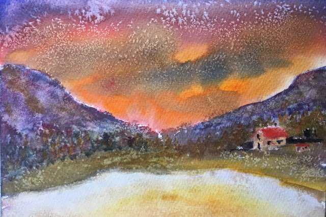
The Thin Ice
After the disaster that was The Brimham Rocks, I wasn’t happy. I wanted to chase the frustrations out of my system by bashing out a second painting, more quickly and with little thought but just painting for the sake of it.
For subject matter, I went for my usual lazy choice of a sunset sky between two hills. But, just to be different, I thought I’d have a lake at bathe bottom with some reflections. Colour-wise I wanted to change all three primaries, so went for French ultramarine, Indian yellow and Winsor red, the key of orange cool. Some opaques made an appearance at the end: titanium white, cadmium red and sepia.
After the sky and hills went down, I threw on some salt, because this was about having fun rather than creating a masterpiece. Then I added the page, putting in hilly and sky reflection colours. But I’d messed up on values again: the whole painting was looking too dark. So I dabbed out the colours in the water and was shocked to end up with something icy looking, complementing the snowy salt patterns on the sky. That was good.
A painting like this needs buildings or people in it to create interest and define scale, so I added the buildings on the right using opaque colours, then put in some trees. The trees, though, were too similarly valued to the hills behind them.
I tried adding snow to the tops of the hills but it didn’t look right, so I dabbed it out and repainted the hilltops. It took a few attempts as the remains of the white were making the colours milky.
This was unlikely to ever end up in the shop window and it’s in the reject pile. The best thing about it is how the orange in the sky and the purple in the hills zing against each other.
Leave a Reply