


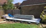
The builders have been round today to put in the foundations for my art studio.…
The Studio
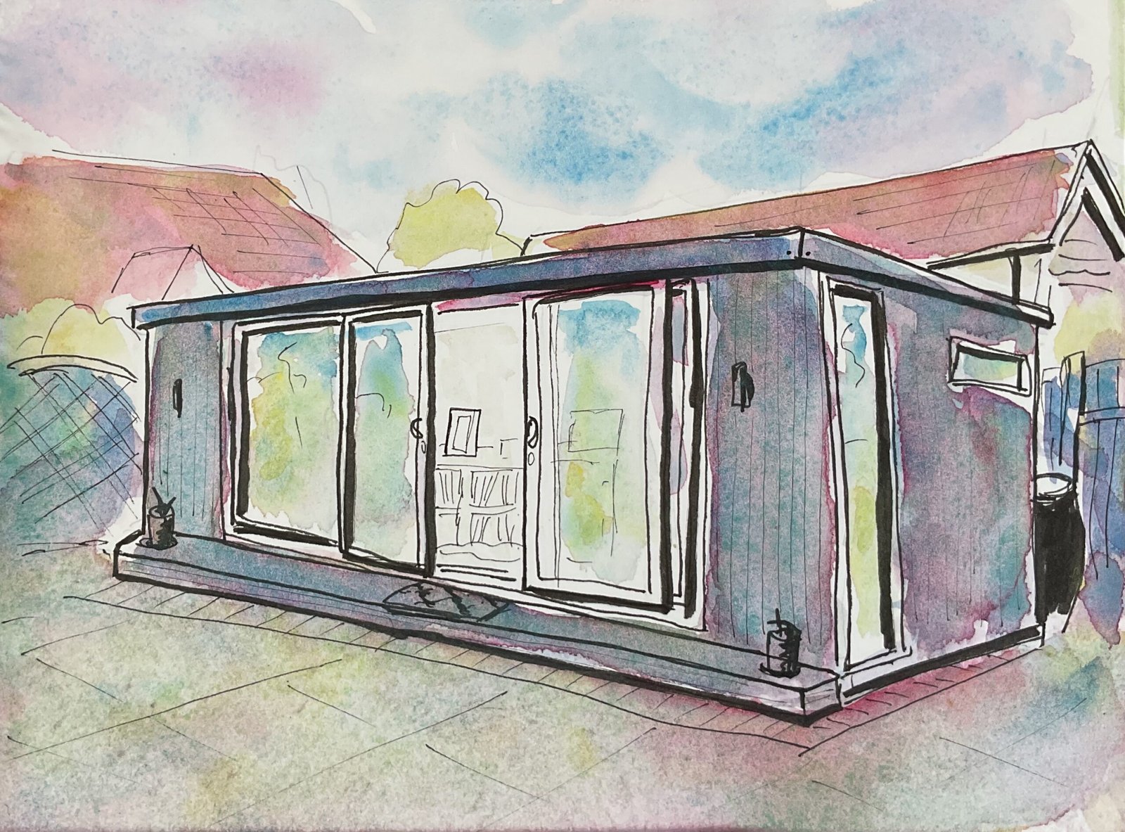
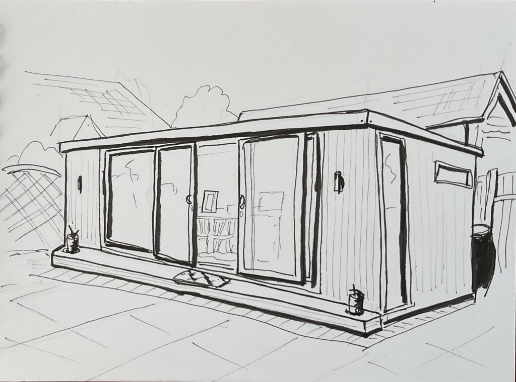
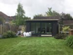
I wandered around the village for a while looking for a subject for my third dash & splash. I wanted to find a drawing spot in the shade as the sun was beating down hard and I could feel myself roasting. Eventually I decided to just head home and draw my art studio from a shady spot on the patio. It feels like a wimpout but here it is:
And the iPad threw up these three colours:
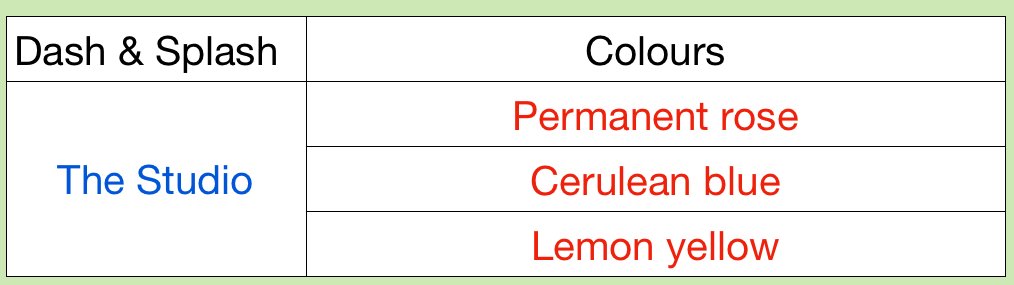
At first sight it looks like I’ve hit paydirt. A red, a blue and a yellow! Surely it can’t get any better than this? Well, the biggest problem with this set is that only the red is truly transparent. The other two are partly opaque and can’t get me to a dark black with the red (the best blacks come from three transparent primaries). I don’t really like the green that they produce either: it’s a bit pale and chalky. It was a smart move the day I dropped lemon yellow from my main palette.
Still, I did the best I could with those colours, mixing them into something vaguely neutral where all three colours could be seen separately. It won’t be going up for sale though as it looks too much like an artist’s impression in a catalogue. And because nobody’s going to want a painting of my studio.
Leave a Reply