


It's looking grim outside, so I thought I'd try out those inktense pencils. It's hard…
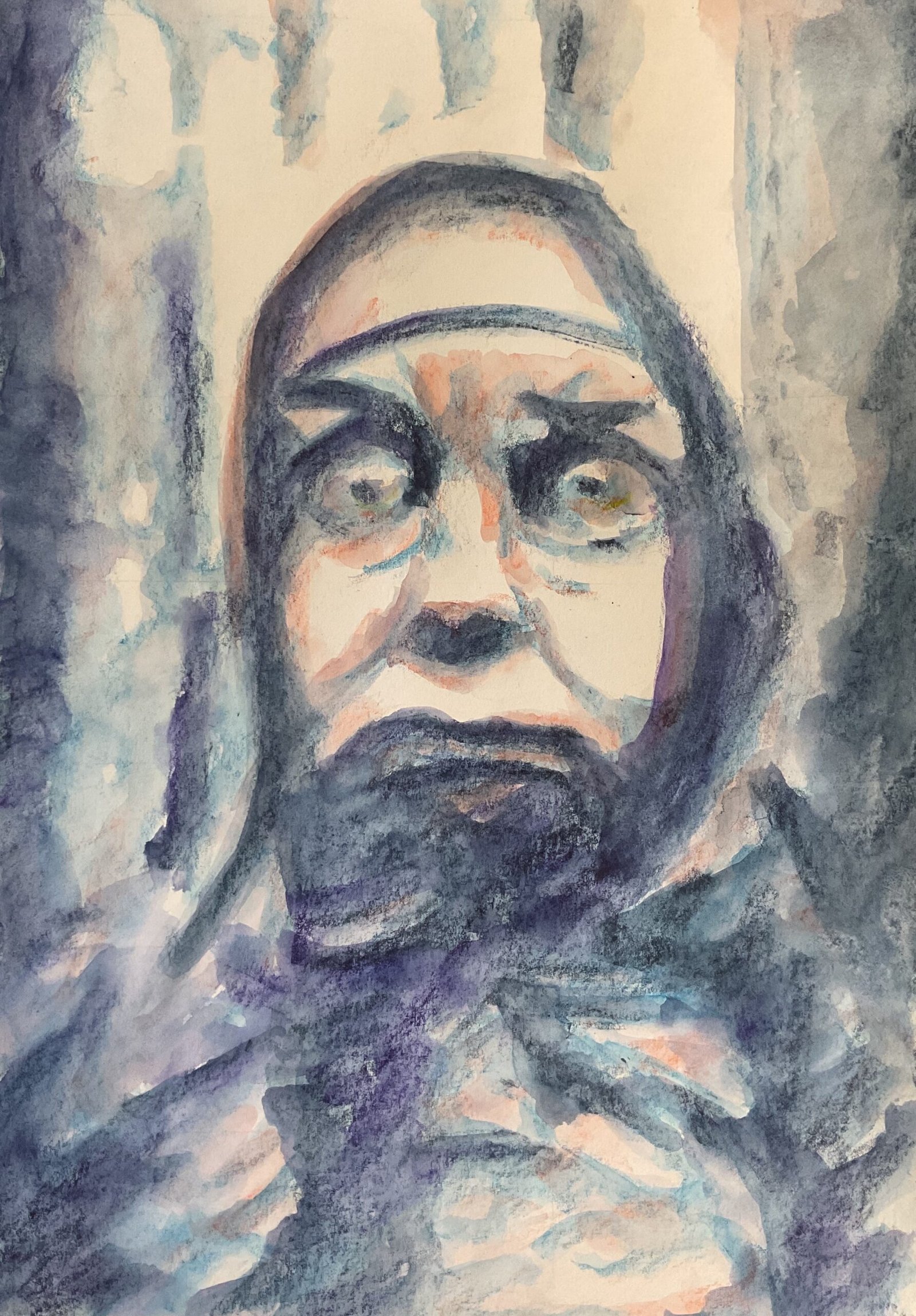
The Singular Death Of Morton
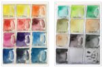
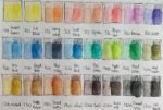
Still too many things going on at the moment for me to have much time to paint but I did have the time today to give the Inktense pencils a runout. Just like last time, this is based on the photography of Petr Valek and named after an Algernon Blackwood short story.
This is in posterised style, with only three values: mediums, darks and highlights. I started by putting down indigo shapes over all the darkest areas. Although I used a grid, I didn’t measure exact points within the squares and didn’t even draw outlines of the value shapes: I went straight in with the side of the indigo pencil. Once the indigo was down down, I went over all the mediums and forks in sea blue. When I went over all the marks with water, though, the two colours looked too similar and didn’t stand out against each other.
So I added more pigment: more indigo and some violet over the darks to make them darker and more distinctive against the blue and wild flame over some of the blue medium values to provide some respite from the blue overload. Somehow, a blue posterised painting looks great in watercolour but doesn’t seem to work in Inktense pencils. Both colours improved the painting, the red more than the violet. I also put a tiny bit of sherbert lemon in the bottom of the eyes.
Throughout this painting I was playing things fast and loose with the brushmarks, looking for some expression and energy. It’s resulted in something abstract looking. Are those trees in the background? Is this a head and shoulders shot or a giant head in the woods? And if it’s a giant head, is it really a head or just an illusion created by shadows and branches?
Overall, not my greatest ever painting but also not my worst. It’s unsettling but not as unsettling as the previous one. This one’s up for sale, with the price to be found here.
Leave a Reply