


First the news. I will be heading along to filming of Landscape Artist Of The…
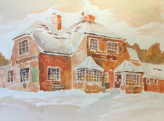
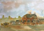
The Rose And Crown In The Snow
I was out and about in the village yesterday, taking more photos and everybody was coming up to me asking whether I was taking photos of scenes to paint. I’m now a local celebrity. I spent this morning planning five more Hartlip paintings – I’m finding it doesn’t feel as painful planning paintings in batches as it does planning them individually. Anyway, one of those planned paintings was from a photo I’ve had sitting around for ages of my local pub in the snow. I can’t remember whether I took the photo myself or just found it on line.
The main three colours today were rose dore, raw sienna and cerulean blue. The blue only appears in shadows, greens, trees and the neutral in the snow and the sky. So most of the painting is only in two colours. A fourth colour, Indian yellow, was added wet into wet into the signs and the downstairs windows – in both places I needed some warmth.
Most of the planning and work for this one was very much chiaroscuro in style – using masking fluid to reserve sky, snow, window frames and highlights. Then on came the paint, with variegated rose dore and raw sienna mixes for walls and chimneys. I made all the left facing walls lighter to give a bit of sunshine. Shadows and windows were in a more neutral tone, with the cerulean blue also included. And with Indian yellow adding some warmth in the windows.
I added some background trees on the left and the right to negatively paint the roofs in front of them. They’re good. There are great colours in there.
Maybe I should have stopped at that point, with the sky, roof and foreground all in white. The painting looked amazing. But the chimney on the right was wrong, covering part of the roof when it should have been behind it. So I turned the extra bit of chimney into roof. And then I got carried away. I watered down the roof mix and added a couple of bits to the roofs. Then more to the roofs. At which point I realised I’d need it in the sky and foreground too, so I tinkered some more. And I glazed over the windows and window frames with this watered down neutral colour, which made the window frames not so gratingly white.
Despite the tinkering, I think this is one of my better paintings. The main three colours work harmoniously together. The neutral in the sky and the colour of the pub walls have two ingredients in common (three if you bear in mind that rose dore is a dual pigment) and just belong together. To anybody that doesn’t understand colour theory, that must look like genius.
This was up for sale for a while but never sold, which was a surprise to me. It’s now been donated to the Rose & Crown to use as a raffle prize on New Year’s Eve to raise money for Shining Stars, a local kids’ charity.
<June 2025: I don’t know who won the painting but I’ve just seen it on the wall in the Rose & Crown, so maybe somebody donated it to the pub?>
Leave a Reply