


I wasn’t very good at painting and not that committed to improving. I would have…
The Regeneration Of Lord Ernie
I got some silverbrush black velvet brushes for Christmas and have been itching to try them out, so braved the cold today and did some painting in the garden. Let’s get the bad news out of the way first though. All the bristles fell out of my 3/4 inch oval brush the first time I wet it. Gutting. Amazon have sent a refund for the three brush set that it came in but insisted on me sending back the useless bald brush, a handful of hairs and two brushes that were perfectly fine. I had a very long call with someone in an Indian call centre who I found difficult to understand and who not only tried to provide me with a discount on future purchases rather than a refund but also tried to negotiate me downwards by quibbling over how much the individual brush was worth on its own. It was an unpleasant experience. For art gear you’re far better off shopping at Ken Bromley or Jackson’s (links provided in the right sidebar) or local art shops than Amazon.
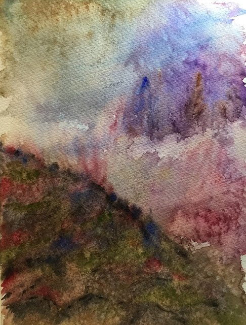
Back to the painting. My original plan was to go for something abstract and minimalistic. Maybe four or five colours. Put them on randomly, tip the paper around and see what happens. Don’t attempt to turn it into something representational. Apart from maybe having a fence post sticking up in the far right and some barbed wire running off it.
None of this happened. What I ended up with was just a chance to get used to watercolour again and to get all my usual start of year errors out of my system. So I was impatient, not allowing paint to dry. I kept adding more colours on top, and dabbing colours away creating quite a muddy foreground hill. And I tried to make things too representational rather than leaving it to to the viewer to decide what was going on.
There were a lot of colours used today. Cerulean blue, French ultramarine, Winsor violet, burnt sienna, permanent rose, permanent alizarin crimson, sap green, olive green. I did find out that I preferred olive green to sap green while I was doing this, not that I plan on having any greens other than the transparent and single pigment viridian in my palette in the long term. There may have been a little bit of Winsor orange, Winsor red, quinacridone magenta and lemon yellow at some point too. The lemon yellow made some interesting pastelly colours when I dropped it into the foreground hill – the sort of colour I’d get from mixing using white. But lemon yellow is opaque, so not a long term colour for me – cadmium yellow Is my preferred opaque yellow. At one point I tried glazing over the whole foreground hill with Indian yellow in an attempt to warm it up and unify it. But the paint below it was still a bit wet, so this just. muddied it. And I applied some sepia towards the end to try to get some rocky textures in the foreground hill. It’s just made it even more muddy though.
What’s good about this one? The sky, where I’ve dropped in some green (a Johannes Vloothuis idea). There’s some good salt effects in places. And, although it’s not evident in the final painting, blotting out sepia using kitchen paper created some good granulation effects. Oh, and at one point I had some good fog along the bottom of those background trees. Too much good stuff going on that I just couldn’t leave. Grrrrr.
And what’s bad is that foreground hill. There are lots of interesting colours but there’s a muddiness to it and none of the zing that people have grown to expect from my colours.
Overall, this was a case of getting some cobwebs out of the system. I originally thought it wasn’t great but it’s grown on me since then, so it’s now up for sale.
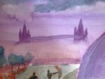
I couldn’t think of a good name for this one, so I looked through the names of Algernon Blackwood short stories and found one that was set in the mountains.
Leave a Reply