


Today's one of those weird days of the year. The day before my birthday. Who…
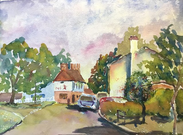
The Red Lion, Weston
It was looking too hot outside today to venture out painting, so I looked through my files for something I could paint in a shady spot in the garden. I found this view of The Red Lion in Weston, Hertfordshire. Weston is the village I grew up in and The Red Lion was a pub right in the middle of the village. It unfortunately doesn’t operate as a pub at the moment, instead being a venue for hire. We used it for the wake following my dad’s funeral a few months ago and they did a cracking job,
With there being a lot of white walls in the photo, I picked French ultramarine, quinacridone magenta and transparent yellow as my three colours. This is the key of purple cool, and I deliberately chose this key after seeing what it did to the white walls in Craiglea And Sanquhar, Hartlip. Talking of colour keys, somewhere down the right margin of the website (if viewed on a PC or tablet) you’ll find a set of labels that let you see all the paintings that I’ve done within each key. I find it quite handy to use these links to help me choose colours to be honest. As well as these three colours, three opaque colours made appearances at the end.
As well as planning my colours, I actually planned my values today. The big idea in my value plan was that there should be a big value contrast between the lightest and darkest colours around the pub. I also decided that the car in the drive should be changed from white to red to not confuse it with the house behind it and to not have any accidental value contrasts away from the pub.
And then I did the painting. It was the usual process. Pencil outline, some masking, then painting from the back to the front, and removing the masking fluid at the right time and dabbing in opaques at the end (titanium white, cadmium red and cadmium yellow today).
Apart from better than normal planning, the two things I did most differently to normal were:
– to include some cars. Cars normally scare me but the cars in my source photo were all quite simple views that I was able to paint as simple shapes, so quite friendly.
– (with one exception) dabbing in trees with the side of a normal brush rather than stabbing them in with a Terry Harrison Merlin brush.
How did it end up? Well, I’ll start by listing the three things I got wrong:
– there’s a perspective problem on the pub roof. The lines along the top and bottom are diverging as they go backwards when they should be converging towards a vanishing point. Something that was due to loose painting rather than dodgy drawing. And to be honest, it’s not an error that immediately jumps off the page – it just sits there and hopes not to be noticed.
– there’s one tree in the right that I stabbed in with the Merlin brush rather than dabbing it in. This was a mistake. Stabbing brings it more into focus and leaves it competing with the pub for attention. I did what I could to soften the focus and the red bits I added being blown around by the wind may or may not help fuzz out that part of the painting.
– going over all the shadows a second time. At one point the shadows in the road were violet and made the painting look really sunny. I should have left them as they were but thought they weren’t dark enough, so went over them again in a darker, more neutral colour. This lost me a bit of sunshine. A classic case of tinkering making a painting worse rather than better.
But look at that sky! Look at the colours in the road! Look at those colours in the trees on the left! And, most of all, look at those colours on the white building on the right! There might be a couple of things wrong with it but the colours in this painting are what everybody will notice.
This one was gifted to someone with long standing connections to the village of Weston as an 80th birthday present.

Leave a Reply