


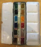
And here it is, the 2021 12-pan palette. The squad has finally been announced.…
The Palette
At some point, every artist with a blog needs to disclose what paints he has in his palette. Artists like to read articles like this just for the adrenaline rush of confirmation bias when they find that someone else has a palette similar to theirs.
The principles behind my palette are pretty simple. I want at least one warm and one cool version of each of the three primaries, I want a couple of earth colours and I’m too snobby to even think about greens, purples or oranges.
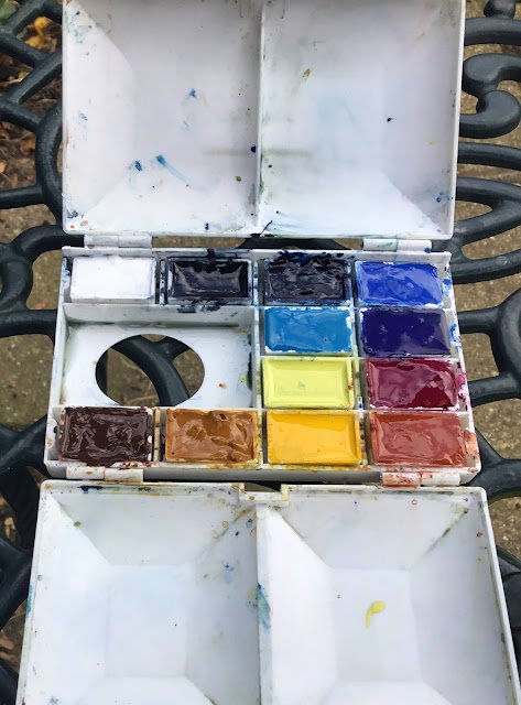
Anyway, here’s what I’m using at the moment, going left to right, row by row:
1. Titanium white. Never mixed with other paints. I used to use it for adding sheep as a finishing touch. Nowadays I only use it for spattering stars in the sky or daisies in fields.
2. Payne’s grey. Mainly for shadows, clouds, silhouettes.
3. Prussian blue. A cool blue (i.e. towards green). It does make really good greens.
4. Cobalt blue. A middling all-rounder of a blue, neither warm nor cold.
5. Cerulean blue. Another cool blue. Should make good greens and skies but I’m struggling a bit with it. Also supposed to be good for fleshy tones but I’ve not been exhibiting any flesh in my paintings…yet.
6. French ultramarine. A warm blue (i.e. purple end). One of my top three colours. As well as great purples, it makes great greens.
7. Lemon yellow. A cool (i.e. greeny) yellow. And it does make good greens.
8. Quinacridone magenta. A cool (i.e. purpley) red. It makes great purples and a little bit of it works wonders in dark clouds. If you’ve been looking at my paintings you’ll not be surprised to hear that this is another of my top three colours.
9. Burnt umber. What they call an earth colour. I think of earth colours like herbs. You can mix up whatever you want from primaries but you sometime see need a little bit of earth colour to get them right.
10. Raw sienna. Another earth colour. There’s often a lot of this sitting unnoticed in my skies.
11. Cadmium yellow. A warm (orangey) yellow. The final one in my set of three favourites. It works in greens as well as oranges and it has more zing than lemon yellow. Lemon yellow still has a role to play in more understated greens.
12. Light red. This is my warm (i.e. orangey) red.
The palette’s not set in stone. Cerulean blue is clearly struggling and might be deposed by cadmium red at some point. It’s another warm red but very different to light red. Whereas light red is bricky, cadmium red is letter boxey. And Prussian blue might come under pressure from phthalo blue, another cool blue. I might even at some point save all this angst and widen out to a 16-colour palette if I ever treat myself to one of those brass hand-made Roberson-style palettes but that’s another story.
Leave a Reply