


The nights are fair drawin' in and the days are getting colder. I thought it…
The Other Travellers Came Walking Down The Track
<Spoiler alert: stinker incoming>
After reading Robert Dutton’s book, I was in the mood for a charcoal painting. Not just any charcoal painting but a mixed media charcoal painting because MIXED MEDIA IS REALLY EXCITING!
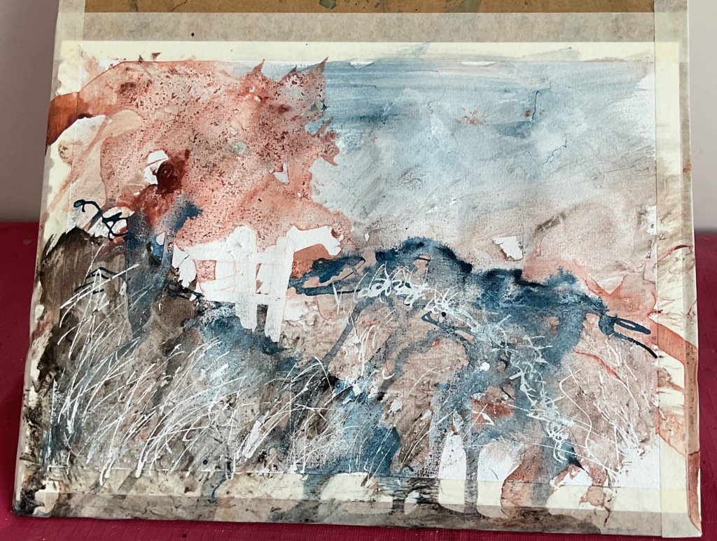
I started yesterday afternoon by putting down an underpainting in acrylic inks. After masking out the gate and a few grass stalks, I went in with French ultramarine, sepia and red earth as I thought these would work best with the charcoal. I dropped in water and granulation medium, looking to get some interesting effects. What I ended up with was a bit of a mess:
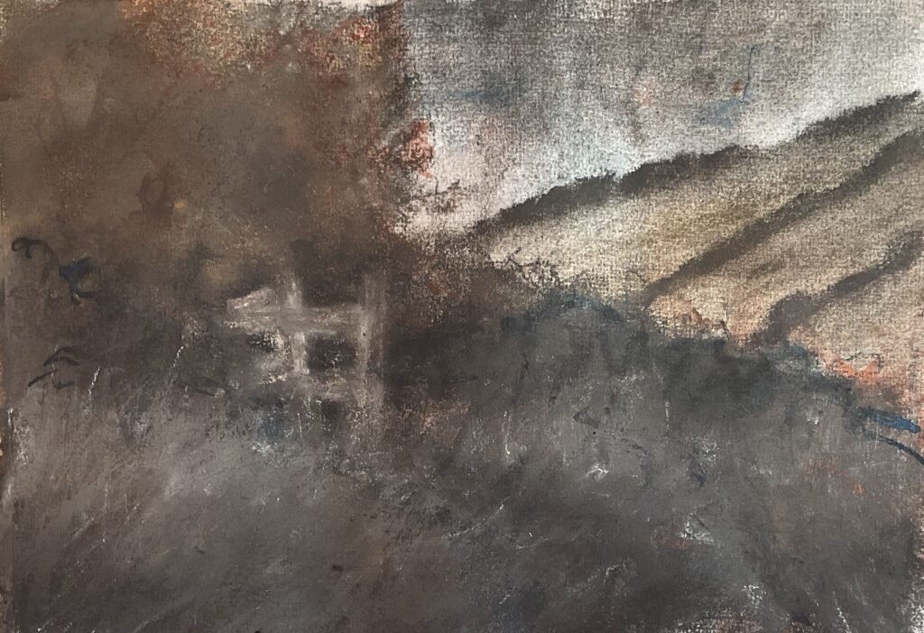
Then today I went wild with charcoal. I used vine charcoal, charcoal pencil and the XL blocks. Of them all, the blocks feel most natural to me: I think I prefer robust feeling media. I worked from the back to the front, using whatever colours felt right at the time. I added pigment in the sky and dragged it down with my finger to create a rainy looking sky. I found the chamois leather removed lots of pigment and used it to remove charcoal from the bottom of the distant tree lines, leaving straight edges. For most of the painting, I was trying to control values, getting darks right behind the gate and trying to get a foreground that was dark at the bottom and light at the top where it could contrast against the middleground. I tried painting with erasers (both putty and traditional), removing pigments to create highlights but without luck: the charcoal had its feet firmly under the table.
While I remember, a word about the paper. Robert likes to use cold pressed watercolour paper, so that’s what I did. I didn’t use my very best (Arches) paper, instead going for the Seawhite paper that I use for coloured pencils. This was a mistake. The masking fluid tore the paper in places and I suspect that my problems with making marks with erasers may have been paper related too. I’ll be keeping the Seawhite for coloured pencils in future, a medium with which it works brilliantly.
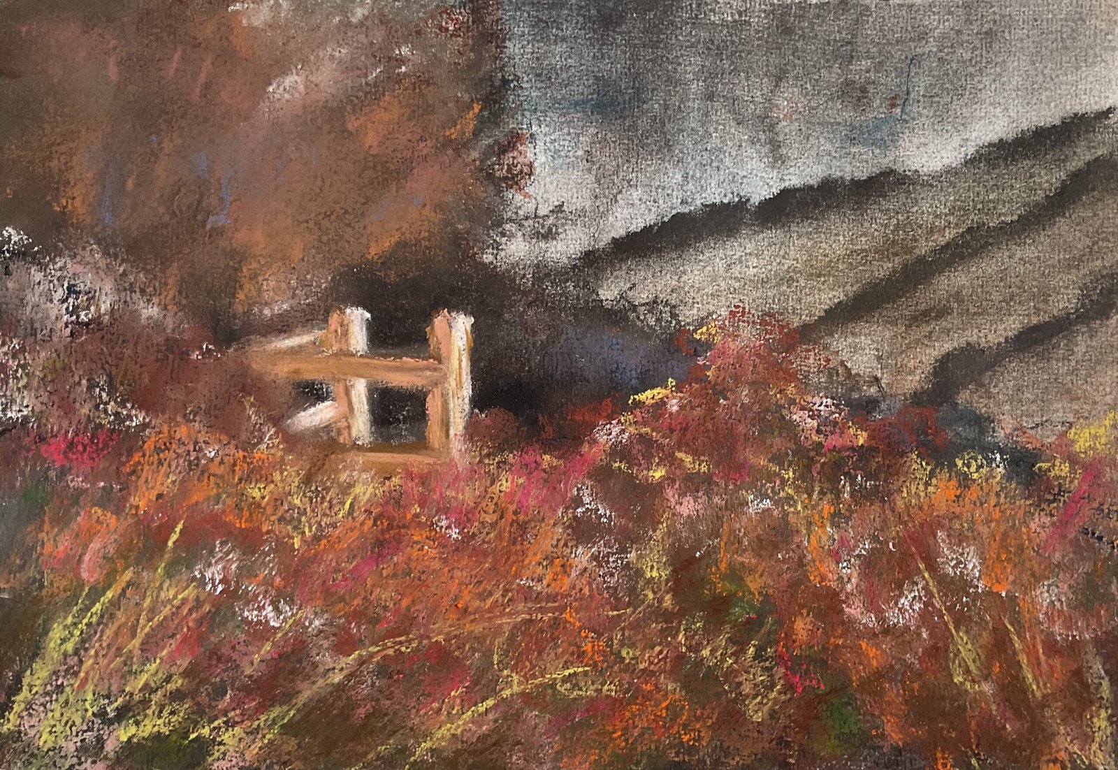
Back to the painting. Once the charcoal was all down, I decided to follow another of Robert’s ideas and introduce some soft pastel. I used just black and white, darkening the darkest blacks and highlighting the top of the grassy foreground shapes. And that was me done. As this was a charcoal painting, I then sprayed it with fixative and this is what I ended up with:
Yeh, an absolute monstrosity. Robert does tell us in his book that fixative darkens charcoal but I didn’t expect this! Everything had turned black. All my subtle colour and value changes had disappeared. I couldn’t stop here, so I put the charcoal away, washed my hands a hundred times and brought out the soft pastels to try to rescue the painting. I used a lot of pastel in the foreground and on the gate and a little in the middleground. Middleground marks were smoothed out with my fingers and the gate with colour shapers. I left the foreground marks rough and unsmoothed. And that’s where I called it a day.
Despite a valiant effort by the pastels, this one feels like a flop. It’s messy and makes me want to wash my hands just looking at it. On the other hand, I’ve learnt lessons. If I attempt this again, I need to use better paper and not put on as much charcoal if I want to use fixative. And the pastels worked well on top of a different medium: maybe they could work over an ink or watercolour underpainting? Worth considering. This hasn’t been a complete waste of time.

Leave a Reply