Lots of old keys laying around the house after getting all the doors and windows…

The Old Man Of Tarsuinn
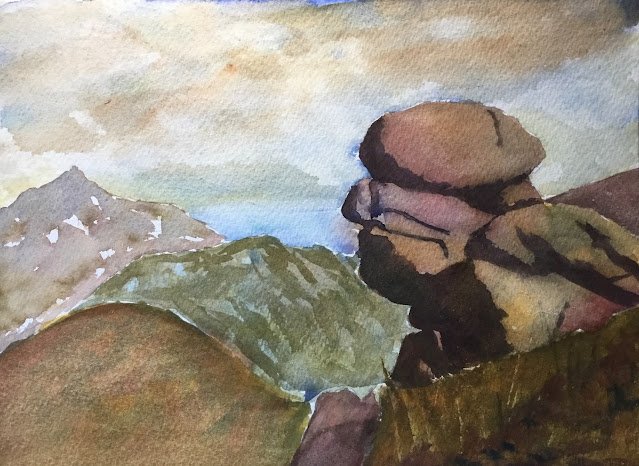
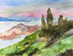
Today’s subject is the Old Man of Tarsuinn, another rocky formation but this time closer to home on the Isle of Arran.
Looking through my swatch cards, I decided on Indian yellow, French ultramarine and Winsor red as my three primaries, so this is in the key of orange warm. Not a key that would have immediately sprung to mind but I liked the look of the neutrals and the dull green. It just proves the value of creating those 27 postcard swatches. Raw sienna, burnt sienna and viridian all play support roles.
The sky was painted using French ultramarine, raw sienna, burnt sienna and viridian and came out looking amazing. This is looking like being a great year for skies for me. The days of painting dark clouds in Payne’s grey are long gone.
And then there’s the rest of the painting. There are five main shapes in there, painted with varying degrees of success:
– I nailed the distant mountain on the left first time. Good value, good colour. Job done.
– The bluey green hill to the right of it isn’t bad. It took a while for me to get the value right on this one, having to apply a couple of glazes over my first coat.
– The foreground hill on the left suffers both from being a boring shape and from being overworked. It took me too many attempts to get this right and the resulting colours are starting to get muddy. If I was still using the opaque cadmium yellow rather than Indian, that hill would have looked far worse.
– The foreground hill on the right suffers from similar problems. It’s supposed to be closer to the viewer than the one on the left (hence the darker value) but looks like it’s at the same distance but with a similar value. A bit jarring.
– And then there’s the rocks. I like how the neutral colour varies over the rocks, with all the different colours within it taking turns to step forward. The shadows suffered for a long time from being too dark compared to the rocks but a finishing glaze of grey (made from French ultramarine and burnt sienna) seems to have darkened the lighter rocks enough for them to look consistent with the shadow while not losing their great colours.
The worst thing about this painting is a compositional error. I should have left out the rock in the middle at the bottom. Without this rock, it would have been more clear to the viewer that the hills in the bottom left was set further back from the the rocks and hill in the bottom right. But the rock has ended up looking like a badly painted path separating two sides of the same hill. When it comes to fitting this painting into an A4 aperture and losing an inch off height, I’ll be losing as much as I can from the bottom.
Overall, though, I like this one. It’s up for sale. To see the price, click here.


Leave a Reply