


Oil pastel paintings are (for me, for now) faster than watercolours, so are the ideal…
The Old Man Of Stoor In Oil Pastel
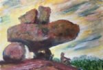
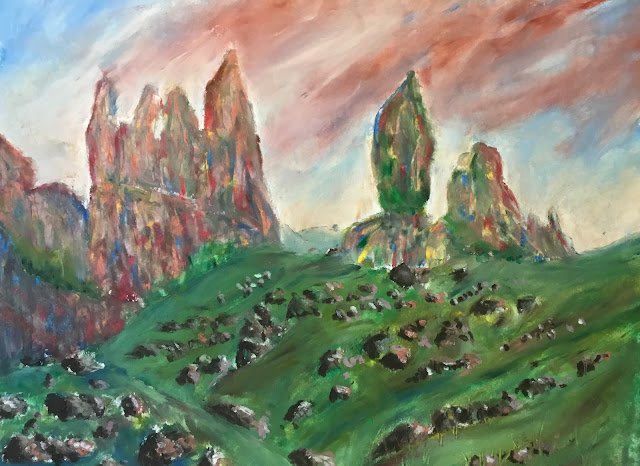
I’m paying a second visit today to the Old Man Of Stoor on the Isle of Skye but this time with the oil pastels. This time, though, I’m using oil pastels and am not going to be afraid to go wild with the colours.
I followed my usual techniques in most places, dotting in lots of colours and mixing them with my fingers. The exception was the big rocks where I made dashed marks instead of dots. I blended them all together with a finger but didn’t get as much texture I wanted, so scraped off lots of jagged vertical lines with a credit card. This not only imparted some texture but also allowed individual colours to shine through where, before the scraping, there had just been neutrals with little hints of other colours in places. Maybe I need to re-examine my colour mixing and be much more localised, not allowing everything to turn into a neutral.
The green foreground initially clashed too much with the rocks at the back. So I introduced some reds and blues to the mix (for a bit of harmony) but also added lots more little rocks than I’d had originally. The rocks not only temper the green but also help shape the hillside. The rocks are quite simple: a random raw umber shape on the left and a bit of grey green, light English red or violet ochre on the right , with a tiny white highlight.
I’m not putting this one on the shop window. The thing I like least about it is the clouds. They’re fine on the right, but on the left they’re tipped at a different angle, an angle that would be too steep if applied to all the clouds.
Leave a Reply