


I wasn’t very good at painting and not that committed to improving. I would have…
The Old Forge In Watercolour
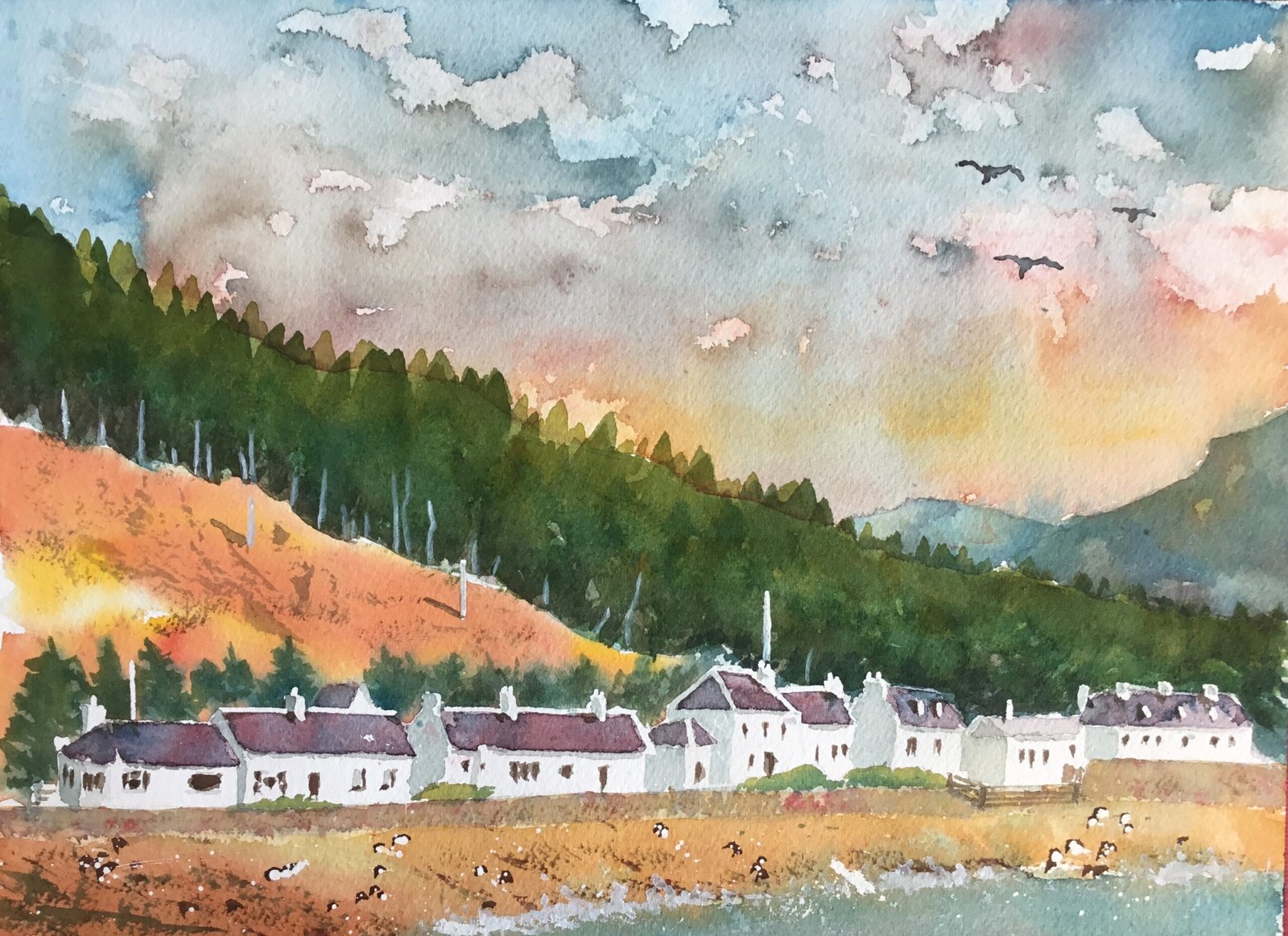
I’m back on the watercolours and couldn’t resist having another go at The Old Forge in Ivernie. It was tempting have a go at this scene in tundra colours (maybe tomorrow) but I need to restrict my use of cheat code paints if I’m to keep getting better at this painting lark.
I quite fancied having some sunset colours in the sky so was thinking about using French ultramarine, Indian yellow and Winsor red. But then looking through my notes to see whether this could give me the purples I needed for rooves, loses these three colours were all warm and would result in an inappropriately hot feeling painting. So, I switched the blue to Winsor blue (green shade), which my notes tell me should result in a painting that looks cold outside but with the heating switched on indoors. I’ve also told myself it makes great sunsets and that there can be some good green/orange clashes going on. So let’s see.
So the scene went down in pencil, using a grid but with a lot less careful draftmanship than normal. I then reserved loads of white edges and chimneys with masking fluid and masked out the edges of the big white shapes. I also put a few small spatters over the beach.
The first shape to go down was sky. After wetting the paper it went down in four bands: blue, red, yellow and red from top to bottom. The blue and yellow bands have to be kept apart to prevent green appearing in the sky. But what about the blue and the red? They were blending together to give an ugly muddy colour rather than purple. I tried to solve this problem by putting in clouds using a combination of lifting paint out with kitchen paper and dropping in a shadowy colour mixed from all three primaries. But things still looked ugly: I’d covered up the boundary between the blue and red bands but the was no link between the two colours and it was difficult to imagine how they might be merging behind the clouds. So I have up on that idea and sprayed water all over the sky using a cheap “fuchsia sprayer” that I’d picked up in Poundland a couple of day ago. The paint started running down the page, so I tipped it sideways and got the amazing result that you can see here.
Most of the rest of the painting was done one area at a time and in several layers, starting with an underpainting. Specifically:
– I’ve not much to say about the two background hills on the right. They both took three layers of colour. I tried to keep the values light (especially for the furthest hill) by lifting paint out with kitchen paper. I managed to get to the bluish colour with variegation that I wanted.
– the trees along the top of the hill also took three layers, generally with more yellow along the top and darks along the bottom. It was a mistake for me to put in a hard smooth edge along the top rather than a jagged edge or an edge that blended into the sky – you can see the smooth edge if you look for it. I tried to negatively paint tree trunks along the bottom without success, so added trunks later on in titanium white.
– the first layer on that orange hillside came out so well that I couldn’t bring myself to all more layers. I just added some dry textural marks after mixing up a dark colour and, late on, shadows from those poles. Poles that I should really have left out of the painting.
– the trees behind the buildings have just two layers. The first was wetting wet into the orange hillside; the second was wet into dry with some fairly standard evergreen tree marks.
– there are two layers of paint on the rooves, mixed from the red and blue with the odd bit of red or blue charged in for variation. Doors and windows were kept simple, stabbed on quickly in two layers. After the masking fluid came off, I added shadows on left facing walls (including left facing sides of chimney stacks) and under the gutters.
– the sea wall took a bit of work. After two layers I wasn’t happy, so for the third layer I took a tiny brush and covered the wall in loads of tiny dots in different colours (including mixes) until it was full and the spots started to merge. Later on, I covered it with watery titanium white and gently dabbed off just enough of the white to leave a bit of texture behind.
– the sea and beach took three layers. As a finishing touch I added some white foam between them in places and a few dark stones. I was careful to add a dark side on the left of all the white spots that had been spattered on the beach.
And after adding three birds in the sky, that was me done.
There’s so much to like about this one. The sky, the well lit orange hillside, the houses, the beach. Even those trees along the top of the hill look great if you can unsee the smooth edge along the top of the top of them from the underpainting. There’s also an interesting green/orange clash and some interesting compositional shapes that fit together into a jigsaw.
So what don’t I like? Apart from that smooth edge along the top of the trees? Well, there are two things. First, there’s the size of the trees along the top of the hill. I’ve managed to make the hill look big and, with the hill being that big, those trees must be absolute monsters. And, second, despite me liking all the big six elements (sky, background, trees, orange hill, buildings and beach) and how some of them work together as pairs, I have a vague feeling that as a team of six they don’t really gel: diversity, no make that tension, is a good thing but there might be too much of it here.
Still, I’m my own worst critic and this is good enough to go in the shop window. To see the price, click here.
Leave a Reply