


Here's the review of the second of the three books on coloured pencil that I…
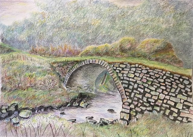
The Old Bridge, Latheronwheel
After reading those two books and coming up with this painting, I think I may finally have “got” coloured pencils. It’s all about adding multiple layers very gently and resisting the temptation to strengthen colours by pushing down hard. You need to get into a zone where you’re just adding colours and not watching the clock. On the other hand, sitting still in the same place bending over a desk for too long can cause a bit of back pain. This painting took me eight hours, made up of four two hour sessions. Coloured pencils are definitely not for wimps.
For subject matter I googled Scottish bridges and ended up with this one close to the East coast, a little way south of John O’Groats. The idea of picking a bridge was so that I could mark out some stones with ink.
Anyway, down went the initial drawing in pencil. Then I added some ink, taking lots of inspiration from Helen Hanson. I marked out lots of stones in the burn, loads of stones on this side of the bridge and the odd stone on the other side and underneath. The stones on this side weren’t religiously copied from the source: I just drew in four or five in different places to give me some idea of angle and scale and then filled in the rest randomly. I also put in some textural dots, filling out some of the greenery shapes so that I could still see where they were after rubbing out all the pencil. And I added a few bits of flora.
And then I added all the colour. I started from the foreground and worked my way backwards. I added loads of coats, all of them ridiculously softly and holding the pencil in the middle, a long way from the point. I didn’t just use greens but also earthy browns, the odd grey, blues, yellows (cadmium in the sunniest places, reds and pinks (madder gave me some great shades). Just everything really.
For all the green areas (so everything except the sky, the bridge and the mist distant trees) I tended to start with purples or earthy colours, these being rough complements of the green that would dominate those areas – this was following a tip from Arlene Steinberg. This colour would only be added in certain places and for each subsequent layer, I’d do the same, only adding it in places. For the background trees, though, I was looking for something cool and blue that could recede, so after starting with some purples I covered the whole area in Prussian blue and this worked brilliantly. For the bottom left area, I also marked out some grasses with pencil, ink and an embossing tool.
After putting down each green area, I’d mix the colours together with blending stumps, being careful with the direction of my strokes, so that if they showed up (which they did) they’d only add to the image I was trying to create.
For the bridge, I started by darkening the gaps between the stones with blues, greens and browns. I used three of each colour and varied them around so that all 27 combinations would feature. For the stones, I used cool greys, then put in random colours, applying them separately to each stone.
The final step after completing a first stab at all the colouring was to take a step back, work out whether the painting fitted together and make corrections. At this point I decided the inked stone outlines were too vivid, drawing the eye away from other parts of the painting. So I went over all the gaps between the stones with the sepia pencil, pushing quite hard and trying to make the ink lines invisible. I also thought the ink wasn’t uniform enough over the painting, so added more in places: some random grasses to mark edges, some dots for texture and some extra rock outlines along the side of the burn around areas that were supposed to be grass rather than rocks. I also raised the grass along the bottom of the bridge and the burn, overlapping them into those shapes so that there was no need for them to have bottom edges. And then I was pretty well done.
This was a successful painting in my opinion, and a big step forward for me artistically. There are some great multi-level colours in places, most notably above the bridge and in the big grassy bump in the bottom left. And just look at the underside of that bridge! The tooth of the paper is doing some heavy lifting there and making me look outrageously skilled.
If anything, it’s the inks on this one that let the side down. I can’t help wondering how much better this would look if I’d not used inks at all. Or at least used them less (so not for rocks or the bridge). Going forward, I might use less of the inks. And in my review of Helen’s book, I did say that it could also serve as an introduction to ink-free coloured pencil landscapes, so maybe that’s the way to go. Leaving out the inks would also leave me happier using this grainy cold press paper, so double winning.
Anyway, this one’s up for sale. To see the price, click here. Maybe I’ll do another coloured pencil landscape in a couple of days.

Leave a Reply