


My plan today was to play things fast and loose by putting down a random…
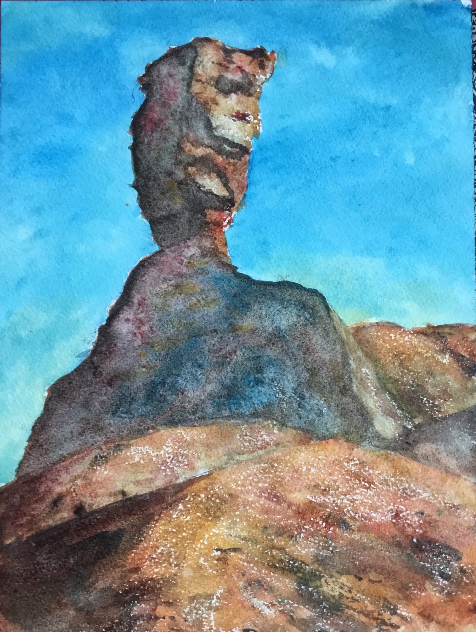
The Mukurob In Green Warm
After a huge gap of twenty seven days, I was back on the watercolours today. I was feeling a bit bereft of inspiration, so went for The Mukurob again, albeit from a different angle to last time, with one side all in shadow. But rather than just going through the options using the desert supergranulators again, I challenged myself by using my regular watercolour palette.
I’d already decided to use hematite violet in this one to get some nuttiness and granulation but I still needed to choose my red, blue and yellow. Rose dore was an easy choice as my red but, looking through my swatch book, I was torn between Winsor blue GS and French ultramarine and between Indian yellow and raw sienna. After trying out some swatches on the back of an old rejected painting with all the colours, I opted for raw sienna and Winsor blue GS, so this is in the key of green warm, the same key as my previous Mukurob effort that was painted using the desert supergranulators. Oh, I used a bit of titanium white towards the end, not that it shows that much.
I kicked off with a rough pencil drawing. I used a grid to do this but only as a very rough guide: there was nowhere near as much draftsmanship put into this one as there is in my portraits. After that, I reserved some whites with a candle. I drew on some marks but also rubbed the candle on its side over the paper to add some texture. The texture marks worked out really well and I need to try this again in future, remembering that I used rough paper today and that the results might be different on cold press paper.
So onto the colours. For the sky I used mainly Winsor blue GS with a bit of raw sienna at the bottom. Like a fool I screwed up and let the blue bleed into the yellow, giving some green in the sky at the bottom. I also messed up by laying in the blue a bit too thickly but managed to rescue things with water and kitchen paper, even ending up with a two tone blue sky that suggests a tiny bit of cloud: not enough cloud to create any white shapes.
For the first layer of colour over the rocks, I should have just done one wash over everything, largely ignoring shadows and definitely treating all the hills as one big shape. Instead, maybe lacking a bit of confidence in my ability to be able to separate shapes in later washes, I painted shadows and separate hills as separate shapes.
I knew that was a mistake straight away, so for my second layer, I put a wash over all the rocks, treating them as one big shape but putting a bit of variation in there with more red, yellow or hematite violet in different places.
And then for the third coat, I went over all the shadows properly with a neutral colour mixed from all four of my main colours. It was all looking a bit flat, so I dropped in more red, blue or yellow into places where I could see these colours in the shadows on my source photo.
And the final stage was tinkering. My biggest problem at this stage was the light shape down the edge of the shoulder. I tried using all sorts of colours here, eventually resorting to lightening it up with titanium white and adding some blue to the yellow and red that were already there. It’s not perfect but it’s the best I’m going to manage. I also added the odd crack in the ricks and drybrushed some colour across foreground for texture. And that was me done.
I admit this isn’t my greatest painting. The right shoulder still doesn’t satisfy me and the mounded shape of the foreground hill is a bit too round. But there are big ticks for the colours in the shadows and the foreground, for the texture effect from the candle and for the path into the painting, gradually curving around to the right. A path that was just a lucky accident. All in all, good enough to go in the shop window.

Leave a Reply