


After a huge gap of twenty seven days, I was back on the watercolours today.…
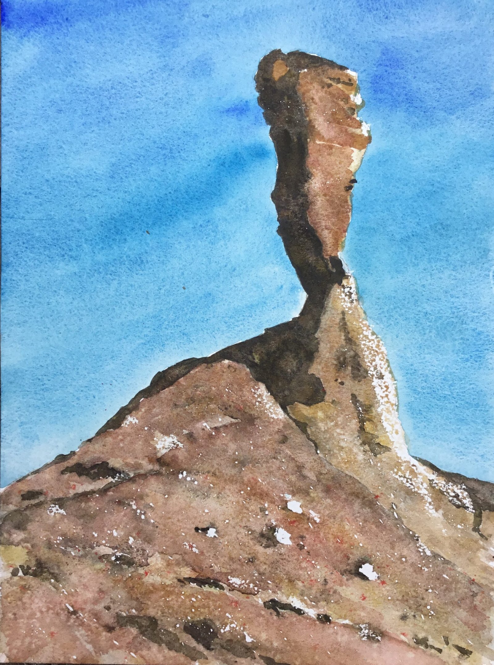
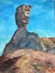
The Mukurob (Finger Of God)
So after finishing Hazel Soan’s African Watercolours I wanted to strike while the iron was hot and paint something influenced by the book. For African subject matter I picked this rock formation in the Namid desert near Asab in Namibia. This rock formation no longer exists – it collapsed back in 1988 and Hazel talks in her book about how she visited the site just a few weeks later. I picked out a source photo that had one side of the finger in shadow, which is an interesting look. Two other influencies that Hazel had on this painting were the cool sky colours and all the white highlights.
The colours today are the desert supergranulators, supplemented by cerulean blue, Winsor blue (green shade), French ultramarine, cadmium red and a little bit of sepia.
First things first. Preparation. I put down a pencil outline using the grid method, including the outlines of the shadow shapes as well as the obvious edges. I spattered on some masking fluid, mainly over the foreground rocks and being carefulness make the spatters directional, sloping downwards from left to right in the foreground and almost vertically downward in the neck of the formation. Looking at Hazel’s paintings, I’ve noticed that she highlights rocks in carefully chosen lines that are part of the composition. I also added some highlights both scattered around the foreground and down the right side of some of the rocks using a candle – the first time I’ve ever used the wax resist method. Again I tried to put the highlights in lines. I also put more highlights down the right of the rocks like I’d normally do. After seeing Hazel’s work, of course.
Then it was time to paint, starting with the sky. After seeing in Hazel’s book (not just the African one but others too) how hot cool blue skies make the day seem hot, the obvious starting point was cerulean blue, a cool blue with granulating properties. To keep the painting feeling hot, I didn’t put in any clouds and this left the sky looking a bit, well, monotone. So I also put in some Winsor blue (green shade) about half way down and some French ultramarine at the top. These two blues are cool and warm respectively. I think that keeping my brushstrokes at an angle also added a bit of interest.
Then for the rocks, I started with three layers. The first was made up of all five tundra colours with the grey and green in the shadows and the yellow, orange and brown everywhere else. I variegated the colours around and tried to get some granulation going by charging in little spots of paint here and there. Everything was all put on together and allowed to mingle on the paper.
The second layer of colour was applied in two stages because I wanted hard edged shadows. First I went over all the shadows with the desert grey and green and, only after this had dried, went over all the lighter areas with desert yellow, orange and red. Again I tried to keep things variegated. At this stage I also added in some wet into wet foreground rock shadows and background rocky cracks with the desert grey and green.
The third layer was mainly a thin glaze, again accentuating the shadows in grey and green but also distinguishing between the bigger rock shapes with big, non–variegated glazes of the yellow, orange and brown in different places. I also spattered some cadmium red and sepia over the foreground (too early, with the paint still wet) and sprinkled in some salt (too late, with the paint too dry).
I thought that would be me done but I did two last bits of tinkering:
– I wanted the sandstone to look redder on the finger and in the foreground, so I added a really thin glaze of cadmium red in places. Not like me to use an opaque colour like this but my excuse is that there was already a lot of cadmium red on the painting, within the desert brown and desert green.
– once the cadmium red glaze was dry, I added some hard edged shadowy foreground stones in desert green and desert grey.
And after removing all the masking fluid and any surplus salt, that was me done.
And how much is there to like about this one? I wouldn’t say that everything I did today was a success (the salt and the sepia and cadmium red spatters didn’t work out) but I can say that nothing failed disastrously. The wax resist with the candle worked out better than expected, the blue sky and highlights make the day seem baking hot, the complementary blues and oranges work well together, the shadows seem natural. I’m even looking at this and thinking it looks like a Hazel Soan painting, even if her colour palette doesn’t look like a set of Schmincke desert supergranulators. This is my best watercolour for a while and is up for sale.

Leave a Reply