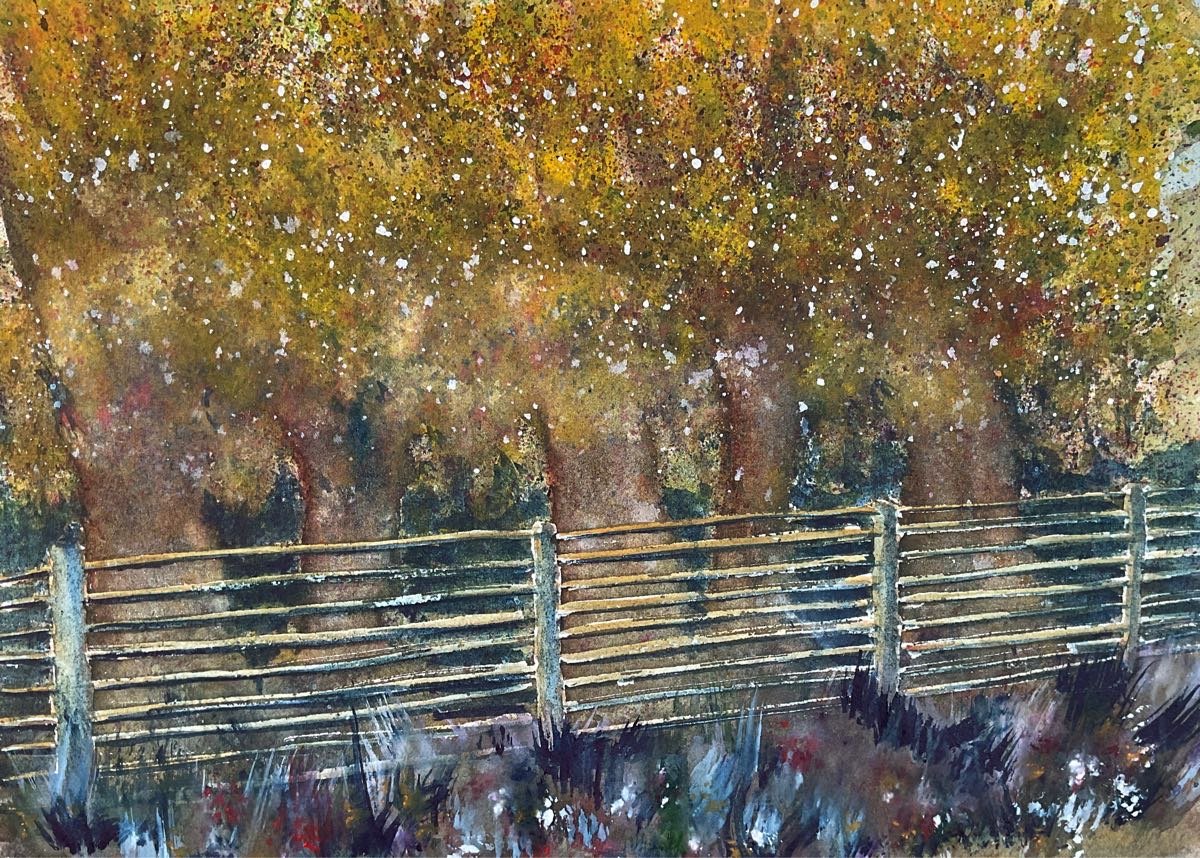
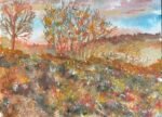
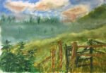
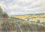
A tale of two paintings today. It wasn’t supposed to come out like this…

The Magic Of Queendown Warren
I wanted to have a go at a painting in the style of those in the Waltraud Nawratil book. I picked another of those views that I see in the North Downs on my daily walks. Waltraud seems to use a lot of orange, indigo, violet and off the peg greens in her paintings, so I thought I’d give the Winsor & Newton halfpans an outing. They’re only really used these days for dash & splash paintings so are probably feeling underused. My plan was to use loss of colours from the halfpans behind the fence and a combination of a couple of my normal tube colours on this side, to emphasise the presence of magic on the other side of the fence but I ended up using the halfpans all over.
The process today was:
– Put down a pencil outline. No need for a grid today. It was hard to go wrong drawing this one freehand.
– Mask out the fence. This was probably an error. The fence ended up too distinct from the rest of the painting.
– Then the fun started. I spattered lots of a cool yellow all over the top half of the painting and sprayed water on to make it run around. While the paint was still wet, I ran a brush through it in places to start bringing out the tree trunks. The way the paint was running, two more tree trunks appears that don’t exist in real life. I should have left it to dry but, while it was still wet I spattered in lots of bugs of random colour, then let it dry, leaving me with a muddy green.
– I painted in the tree trunks, starting with burnt sienna down the left sides but then dropping in whatever colours I thought might look good. Reds, blues, greens, everything. I sprayed water on to soften everything and started dragging tree trunk colours into the forest floor to connect them together. And I added whatever colours I thought good to the foreground and connected this to the colours running down from the trees.
– Back to the leafy canopy. I wanted to put on more yellow and to lose the muddy green, so brought in cadmium yellow from my regular palette, an opaque yellow that would hide whatever was underneath it. I spattered the yellow on and sprayed it with water.
– When the yellow was dry, I spattered on lots of different colours again. I even spattered these over the foreground.
– Back to the tree trunks. I strengthened these with another layer of colour. Burnt sienna and guests, just like the first time round. And again I dragged colours into the forest floor and added another foreground layer.
– It was probably around here that I filled in the white gaps with cerulean blue for the sky and a cool yellow everywhere else.
– The leafy canopy was looking a bit too bright and at odds with the rest of the painting , so I had another go at it. This time, after putting on the cadmium yellow spatters and spraying them, I dabbed off some of the paint with kitchen paper to leave the yellow marks looking more cloudlike, for want of a better word.
– Once this yellow was dry I spattered on the usual random colours and also a bit of white gouache.
– Then I removed the masking fluid and started on the fence. First a dark mix of orange, brown and blue on the dark sides. Then a light mix on the lighter sides. Then an even darker mix on the dark sides. It was a frustrating experience. Nothing seemed to work. The fence kept standing out too clearly. And did it need shadows? This was the point at which I came up with today’s one moment of genius. It solved both the shadow problem and my regret at masking the fence rather than negatively painting it. What I did was to dip my brush in indigo and paint in loads of shadow between the treetrunks, including the areas you can see through the fence. And there you go. We have shadows and a negatively painted fence.
– As a final touch, I added lots of multicoloured grasses in the foreground using the Merlin brush. Without the grass, the fenceposts weren’t connected to the ground. Another masking fluid related problem. And that was me done.
This one’s OK I guess. The fence bothers me though. I wish I’d simplified it, with half as many horizontal slats, maybe thicker ones too. And I wish I’d not masked it out. Oh well. We live and learn. On the other hand, I do like how the indigo shadows have worked out between the trees and I like the indigo in the foreground. I’m wondering now whether indigo could replace Payne’s grey in my palette at some point. And paintings like this tend to get good feedback; other people like them more than I do. So I’m putting this one up for sale.


Leave a Reply