


I've been meaning for a couple of weeks to head out and do some plein…
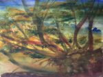
The Lightning Tree, Queendown Warren
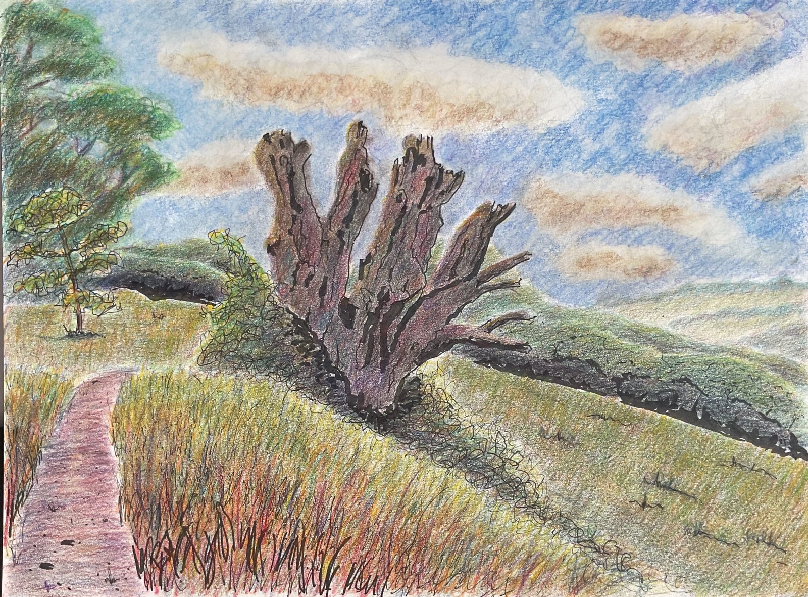
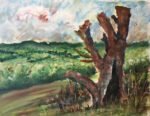
I’m on a coloured pencil landscape roll and, as promised yesterday, I’m having another go at combining coloured pencils with fineliners. This style is inspired by a book by Helen Hanson, a book that, at the time of writing, is still the best introduction I’ve red to using coloured pencils. The subject is a tree in Queendown Warren, one that was struck by lightning years ago, leaving a dead stump full of personality looking out towards the other side of the valley. It’s a tree I’ve painted before. I used hot pressed (smooth) watercolour paper today as this suits the fineliners better,
After putting down a pencil outline, I needed to decide what marks to put down with the fineliner. What I did was to
- draw in the shadowy side of the tree trunk and all the branches
- add in more shadows and some bark texture
- mark in shadows at the bottom of the row of trees in the background
- put some dots on the footpath, bigger dots at the bottom than at the top
- draw the smaller tree in the left
- put down some scribbly texture in the brambles around the main tree
- fill the foreground grass areas with grassy strokes
The spots in the path and in the foreground grass ares have pretty well disappeared so we’re probably unnecessary. And the shadows along the bottom of the treeline might distract the viewer a bit from the main subject: I’m still not sure whether this is a bad thing or whether it’s a good compositional feature.
I followed one of Helen Hanson’s tips and left sky empty until the end, wanting to see how the rest of the painting turned out before deciding what sort of sky was required. But other than that, I generally worked from back to front, alternating between accurate local colours and weird impressionistic colours and jamming along to the Grateful Dead. After today I can tell you that 1977 Dead concerts work best for paintings. A very good year. I was going to say that I worked on one shape at a time but then I remembered I didn’t. Now me then I felt the need to switch shapes. Not because I was getting bored but because I was feeling the need to develop the painting as a whole.
Oh, while I remember, for the middleground hill behind the tree, I started colouring with small circular strokes before moving on to straight strikes up and down the hill to get some three dimensionality and later up and down strokes to create a grassy texture.
The foreground clearly has loads of up and down strokes to create that wild grassy texture. This area started with three or four layers of colour applied in small circles and I only applied the grassy layers after that. For those grassy layers, I graduated from red at the bottom, through oranges to yellow at the top. There were, I think, five different colours in rows. Later I added in some random grassy marks in other colours, notably blues.
Somehow, when using hot pressed watercolour paper, the painting looks complete sooner, with fewer layers of colour, so I eventually stopped. The painting was looking quite sunny, so I added in a sky with just cumulus clouds in it. I blended the sky (and the sky holes I’d managed to leave in the tree on the left) with blending medium, then stepped back to look at the painting. I decided the distant hills needed blending with a paper stump, so did this, stepped back again, blended the rest of the background with the stump, stepped back again and blended the lot with the stump. And that was me done.
This one feels like a big success and it’s going up for sale, there’s so much to be happy about: the sky holes, the distant hills, the colours in the tree line, the tree, the background hill. And all those amazing foreground grasses. A great day’s work but I need to get back to watercolour next. To see the price, click here.
Leave a Reply