


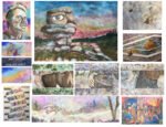
This year's Upchurch art exhibition takes place at St Mary's Church between Friday 17th and…
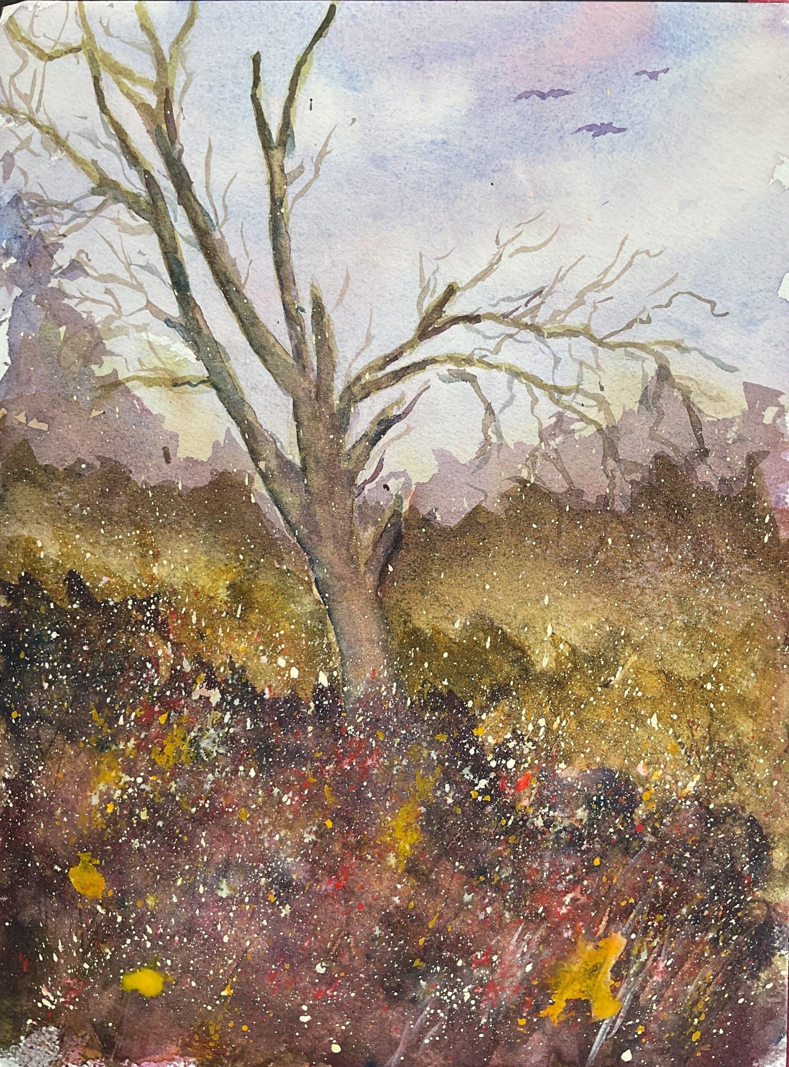
The Lane That Ran East And West
After seeing none of my portraits selling at the Upchurch art & craft exhibition over the weekend, discussing a couple of landscape exhibiting opportunities and watching some inspiring videos on YouTube. I’m going to steer the ship in a slightly different direction for a while. I’m going to grit my teeth and hold back a bit on the portraits that I’m enjoying painting so much and concentrate a bit more on landscapes. And I’m going to try to make them looser and shake off the bad photographic replication bad habits that I’ve been developing while painting portraits.
So I picked out another view in Queendown Warren, one where the tree was the star and that I could try painting carefully, while the rest of the scene would give me the opportunity to let loose with some craziness. This one is in the key if purple cool: I used quinacridone magenta and French ultramarine as I was in the mood for purples and transparent yellow to give the greens a chance to compete. I also used hematite violet genuine to create some texture and cadmium red, cadmium yellow, titanium white and white gouache at the end, mainly as garnishes.
As is the norm with these paintings, I worked from the back to the front. I was loose with the brushwork, copying how <that artist who blocks my comments at will get no publicity here > gets leafy edges to some of his shapes. And at the bottom of each shape I watered down the colour and dragged it into the next shape to create some sort of connection. Whenever I filled in a land shape, I’d add bits of that colour into the tree in places.
One of my places was to have a horizontal band of bright yellow through the middle of the painting to create a George’s Cross style armature. I kind of got the cross but that band ended up a bit greener and more neutral than I was hoping for. On the other hand, there’s a bit of texture in there from the hematite violet, which was something else I wanted to create, so that shape was partially successful.
I wanted the bottom triangle to be dark maybe even purple, and managed to achieve this. All my paint strokes in this area were at an angle, sloping upwards, perpendicular to the upper border of the triangle and creating another George’s Cross. The angle of the strokes wasn’t that visible, though, which is why I added some angled spatters with cadmium yellow, cadmium red and white gouache and scratched in some lines with an old credit card.
By this time, the tree was almost finished but looking a bit dark. I wanted it to be lighter valued, so put in some watery titanium white and quickly dabbed it off. And I enjoyed doing this so much that I added some colour by repeating this with watery versions of the blue and the red. And, after adding some birds in the sky, that was me done: I’d reached the point at which any more tinkering would do more harm than good.
Final conclusion? I’ve done better and I’ve done worse. There are loads of portraits that I’ve done this year that I prefer to this but I expect most people will rank this one higher. I can’t think of a good name for this one so I’m raiding my list of Algernon Blackwood short story titles again.
This one was sold while on display at the Rose & Crown.
And, in other news. I’ve now used up all my hematite violet genuine. It’s an interesting colour, generating some good granulating textures, but the potters’ pink that’s replacing it in my palette is cheaper and looks like it’s even better at creating those granulating effects in mixes.
Leave a Reply