


On the face of it, this is a very similar book to the Jane…
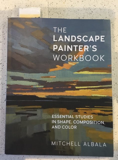
The Landscape Painter’s Workbook: Mitchell Albala – Book Review
Now here’s a book I’ve been looking forward to. It’s Mitch’s second book. The first got rave reviews but was very oils focused. This one is supposed to be relevant to all types of media, so was an easy choice for my wishlist. It’s a 176-page paperback.
Before we talk about content, let’s talk about style. A quick flick-through shows some great paintings by lots of different artists, so it’s immediately clear that this book’s going to be inspirational, even if I didn’t read a word. The flick-through also suggests that this book might be a bit short on words but that would be most unfair. What words there are in this book really pack a punch. It’s not crammed with lots of little tips like a Liz Chaderton book: instead it’s made up of a small number of huge, game-changing ideas that Mitch gives himself time to explain. More on that when we get to content. Most chapters have an exercise of two for the reader at the end and I may try some of these. They’re not all painting exercises though: some of them involve putting tracing paper over other people’s paintings and analysing them with lines, blocks and arrows, In terms of voice, I don’t hear much personality or passion coming through but I don’t hear a dalek either. Instead, there’s a sense of gravitas in everything Mitch says.
Let’s talk content. The first chapter is on thinking in terms of shapes and I’ve not read a better explanation than Mitch’s. There’s stuff in here on values too, but whereas other authors put more emphasis on values, Mitch puts more emphasis on the shapes. The fourth chapter, on notan, builds on the first chapter. Notan at first looks like a two or three level value plan. So black and white or black, white and grey. But the thing is, these notans aren’t there to help us plan and understand values; they’re there to help us plan and understand shapes.
The second chapter is an interesting one on choosing the rectangle that you’re going to be painting. Not just which cropped out bit of a photo but whether to paint it in landscape, square or portrait format. All really useful and thought provoking.
The third chapter covers a couple of composition staples: variation and leading the eye. There’s not much new here but a new explanation is always useful, especially on leading the eye, which is such a difficult concept to understand, let alone apply.
Then, after the chapter on notan, the rest of the book is about colours. First there’s a chapter that tells us that paint can never replicate sunlight and that we need to use tricks to get the feeling across. I can’t lie: this was the most disappointing chapter of the book. I think Mitch’s ideas needed more room to be developed. If this chapter could have been extended from 10 pages to 20, I think it could have been another marvel.
Then we have a chapter on colour strategies. What an eye opener! My idea of a colour strategy is to choose which colours to use and maybe do a value plan. Mitch’s idea of a strategy has three elements to it: the colours (eg similar colours or complementaries), the values (not the value plan with thumbnails but the choice of what range of values, whether dark or light will dominate, etc) and the saturation (bright colours or neutralised colours). He shows us lots of different paintings based on different strategies.
Then there’s a chapter on colour groupings. Something that’s of more interest to the abstracty landscape artists like Mitch and like Tom Hoffmann. We’re shown paintings that can be divided up into shapes but where the shapes can be sorted into colour groupings. So maybe there’s a painting with blues, purples, oranges and yellows, in which case you could divide the colours into a blue/purple family and a yellow/orange family. Maybe my palette would have one set of colours mixed at one end and one at the other. And all the usual composition rules apply to the colour groups, like the groups all needing to represent different proportions of the painting. Not something I’ve ever thought about before but if I keep painting white churches surrounded by greenery in front and behind, maybe I should. It’s also in this chapter that Mitch talks about “colour keys” and likens paintings to music. What Mitch calls colour keys aren’t the same as what I call colour keys, so be careful out there.
And finally there’s a chapter on palette strategy, which is something that comes much closer to what I call colour keys. There’s not much new stuff here but if this chapter wasn’t there after so much discussion about colours, then I think it would have felt a lot like there was a hole there.
Before we get to the scores on the doors, the names on the frames, one other thing. Throughout this book, Mitch describes purpley blues as cool and greeny blues as warm. At first I thought this was just a mistake, with cool substituted for warm or the other way round, but he keeps coming back to it. This will annoy a lot of readers.
So, on to the final verdict. This isn’t a book for beginners. The ideas in this book aren’t the sort of thing that everyone should know. They’re the sort of thing that you put in front of experienced artists who can recognise that this is something that’s not been seen before. I’m thinking here about the colour strategies and the notan in particular but also, to a lesser extent, the colour family groupings and some of the stuff on landscape format vs portrait vs square. And then, to bulk out the rest of the book we have some (valuable and different) takes on well trodden composition topics. But you know me. I like books that make me think differently, especially if they keep me thinking when I’m driving, walking, sleeping,…. Just when I thought there were no more authors out there that would make me think differently, along comes Mitch Albala. It’s a fiver.
🎨🎨🎨🎨🎨
You can find this book and more reviews of it at Amazon UK here. As an Amazon Associate, I earn commission from qualifying purchases but this costs absolutely nothing extra to you.
Leave a Reply