


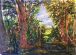
I took the dog out for a walk this morning and found this prefect site…
The House Of The Past
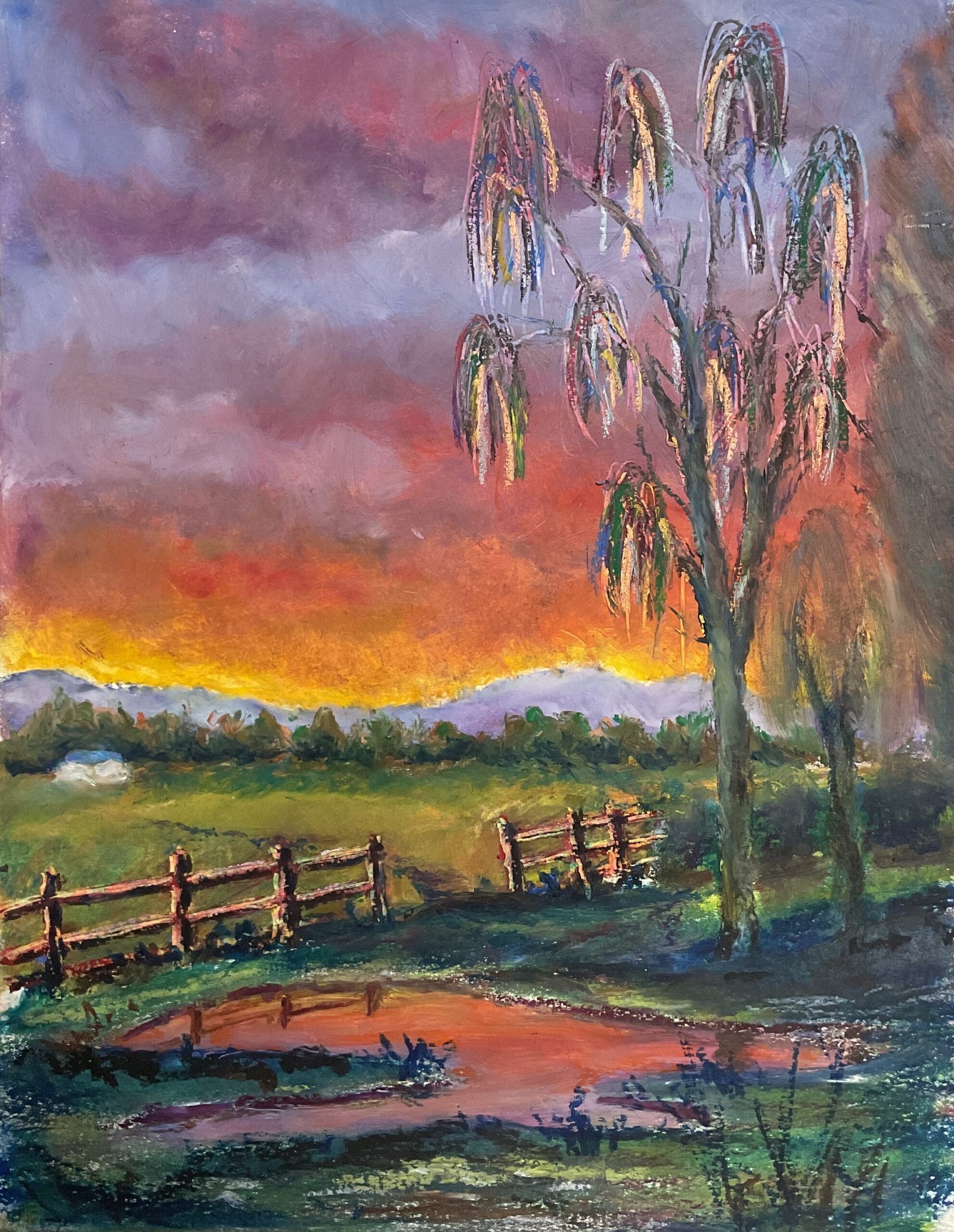
Right, let’s get back to pastel landscapes and show those LAOTY judges what I can do. I went for oil pastels today as it’s still cold. I prefer oil pastels in the winter when they don’t melt and soft pastels in the summer when I feel less claustrophobic with all the messy dust. The scene is based on a photo by my friend Cathy that (I think) was taken in Buckinghamshire. My objective today was to support my LAOTY application by showing that I can come up with something heavily weighted towards warm saturated colours using oil pastels as well as with soft pastel. Which is why I chose a photo of a sunrise with a reflective puddle in the foreground.
I worked through in the order sky and puddle, background, middleground field, hedge, foreground, fence and trees. The puddle needed to be created at the same time as the sky. Because the colours in the puddle were so key to this painting, I made the puddle bigger than the one in the source photo. And it felt compositionally right to make the middleground field lighter than the foreground. And for most of the painting I just added whatever colours felt right, with little reference to the source photo, and blended them with polystyrene chips.
It was the fence and the trees that gave me the most problems. I should probably have used boring dark colours for both (the fence in particular) but decided for whatever reason to start by scraping them out with the corner of an old credit card. Both ended up looking ghostly and not right, so I ended up doing a lot of fiddling. For the tree trunk, I ended up applying several colours and blending them with a colour shaper. And for the droopy foliage, I added marks with all sorts of colours alongside the marks I’d already scraped on. The big tree worked out fine with all this fiddling and I blurred out the other two trees to let it bask in its glory.
The fence gave me a lot of problems and I’m still not happy with the final result. I made several attempts at a combination of light and dark marks before settling on what you see here. My problem was that the fence kept grabbing all the attention and dominating the painting with its hard edges and dark/light contrasts. I removed a section of fence which helped a bit but there was one more thing I could try.
And what I did do to try to distract the eye way from the fence was to add much more detail in the foreground. I’ve added loads of grasses, shadows in Prussian blue (great colour) and even left some unblended draggy marks in places.
The end result? Well, the fiery yellows and oranges in the sky and, to a lesser extent, the puddle immediately grab the attention, that’s for sure. And those Prussian blues in the foreground look great. But after that initial high, I’m not so sure this one works. The fence still grabs too much attention and should have been reduced to a few wonky posts with maybe one horizontal strut. And the trees feel a bit, well, spindly and weak. So not a personal favourite but who am I to judge? This one’s up for sale, with the price to be found here.
Leave a Reply