


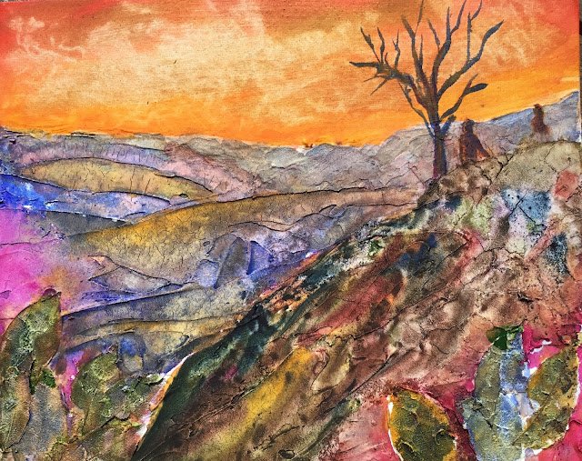
Two paintings today, both on cracklepasted board and both with the help of acrylic inks…
The Hills Are Alive
I think it must have been four days ago when I prepared a couple of crackle paste surfaces for painting. I started painting on them yesterday but had to give up when it started raining. I’ve managed to finish both off today, and here’s the first of them.
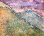
As well as crackle pasting the bottom two thirds of the board and watercolour grounding the top third, I stuck down some “skeleton leaves” in the paste. These are strange leafy things that they sell in arts and crafts shops. I was hoping to be able to pull them out of the paste after it had dried but no such luck – I ended up ripping pieces of them off instead. Oh well.Painting-wise, the idea was to do this one in orange warm, starting with the sky in Indian yellow and cadmium red and introducing some French ultramarine in the hills. Because I ended up using so much quinacridone magenta in the hills, some may argue that the painting is in purple warm. I’m sticking with my original assessment just for the way the sky stands out. Anyway, colours in the hills are Indian yellow, French ultramarine, quinacridone magenta and a bit of raw sienna. I found that the first three of these worked really vibrantly together on the crackle paste and produced lovely greys and browns when they mixed on the paper.
Something wasn’t, quite right though. Maybe the way my crackled and non-crackled areas were almost perfectly divided by a straight line one third of the way down made the painting look boring even before I started. So I resorted again to adding acrylic inks and granulation medium. Most of the inks were indigo, sepia and red earth, although I admit I did add a little green.
But it still looked boring, so I tried adding birds in the sky. They didn’t work, so I quickly wetted them out and instead added the tree and figures. The bottom of the figures didn’t look right, so I dabbed them out with kitchen paper, which didn’t work, so I made it look a if they were behind the hill, or behind a wall instead. And I tinkered some more with the inks
Did it work out though? As usual, there are successes and failures in there. Let’s start with the bad stuff. The two people in there don’t look right. The skeleton leaves don’t really add anything. There’s the sense that the hill on the right has been overworked. And, from a distance, there’s a red triangle in the bottom right that doesn’t harmonise with the rest of the hill. But I think there are some really encouraging bits about this painting. The colour of the sky. The energy added by the orange vs blue complimentary colours. The hills on the left of the painting, with really nice grey shades and the use of the ridges in the crackle paste to separate colours. And the whole impressionist colour scheme – skies and hills don’t come in these colours. This is a brave painting.
Yeah, this one definitely has its merits. It was the first of these crackle pasted paintings to sell and is now on a wall somewhere up in Scotland.
Leave a Reply