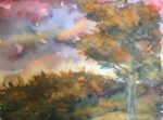
Another quite traditional looking painting today. I was watching a YouTube video this morning where…

The Happiest Days Of Our Lives
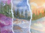
Today’s painting is dedicated to the recently departed Sir Alan Parker, who directed (as well as many other films) The Wall, a film featuring all the music from the Pink Floyd album of the same name. The painting itself is inspired by a single note in the music. It’s at the start of The Happiest Days Of Our Lives. You hear the teacher shout out “You, yes you! Stand still laddie!” And there’s then a single loud note that always makes me jump. That’s the note. In the film, there’s a teacher standing against a foggy coloured background who disappears on that note, leaving the foggy background there. This painting is all about that note.
It’s not really in any particular key today – I wanted to test out some of the colours in the set of halfpans I got for my birthday. In the fog there’s French ultramarine, cerulean blue (a rare appearance, chosen for its granulation), Winsor orange (new), permanent rose (new, deliberately chosen because it looks pink) and burnt sienna. The teacher at the top is made of French ultramarine, Winsor red (new) and Winsor yellow (new). The blackboard in the middle started as Permanant rose, French ultramarine and Winsor yellow but was looking too colourful and not black enough, so I put a thin glaze of Payne’s grey over the top.
In terms of special effects, the three panels were divided up using masking tape. Then masking fluid was spattered over, used to cover the teacher in the top panel and used to write on the blackboard using a masking pen. I deliberately tried to use Gerald Scarfe-like handwriting on the board and I think it’s worked. Using the mapping pen actually made it easy to mimic that handwriting. And finally, I added salt to the bottom painting and to the figure in the top painting. I only thought of doing this at the last minute when I thought the paint was already dry and the salt produced the best patterns I’ve ever seen from it, so I obviously need to add it as an afterthought more often.
In painting the teacher, I was careful to leave some white highlights along the top and left to make him look a bit three dimensional. I also extended the line of the cane back into the body, with both a hard and a soft edge. And there’s a blob of yellow where his hand should be. He worked out well.
Early impressions of the new colours are that Winsor red and permanent rose are both intesting. I need to think about whether a semi-transparent Winsor red could replace rose dore – it certainly has more oomph but I need to watch the transparency level carefully. Permanent rose is a cool red like quinacridone magenta but pinky rather than purpley. Is there room for them both? Winsor yellow is an able substitute for Indian yellow but is unlikely to replace it. And Winsor orange was a very yellowy orange, a bit like Indian yellow (actually it turns out to be a single pigment colour, and one of the two pigments in Indian yellow). Being a semi-opaque colour, it’s unlikely to win a place win my palette.
Overall I think this one’s a success. It came out looking very much like the painting I had in my head at the start. I guess there’s not much proper fiddly painting in there but who cares if it looks good? And I needed a break from fiddling, from landscapes and from restricting myself to three colours. This one was sold at the 2023 Upchurch art exhibition to my biggest fan as a Christmas present for her Pink Floyd loving husband. I’m glad this one has found the home it deserves.


Leave a Reply