I thought it was about time I did another Western silhouette painting as they're always…

The Graduate
It’s been eleven days since my last piece of work but with the sun out and some chores out of the way, the gazebo’s back up in the garden and I’m painting again.
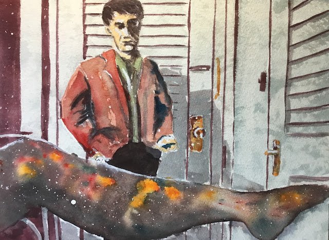
I thought I’d start with this scene from The Graduate which has been sitting in my ideas pile for a long time. It was just asking to be given the Western treatment, with a silhouetted leg in the foreground given the space treatment.
Colours today were Prussian blue, Winsor red and Indian yellow, so this is in the key of orange cool. I picked out these three colours because (i) they are all staining, and (ii) they mix together to a good black. More on those features of the colours later. Titanium white also made an appearance later on.
After drawing some pencil outlines and spattering masking fluid over the leg and some of the background shadows, I put down most of the background in a purple mixed from the blue and red, and added some brassy fittings using all three primaries. I wanted to get these marks down early on, before any pencil marks were painted over, as they felt key to the painting. And indeed, the painting already looked great after putting down these marks. I wasn’t sure at this stage whether I was going to leave the rest of the background white or to glaze some pale variegated wash over the top of it (and having used staining colours in the first coat, glazing was an option).
Next was the leg. I wet the whole area first, then dropped in some reds and yellows that spread a bit. I put these generally along the top of the leg – even though the leg is abstract it’s good to make the top lighter than the bottom to make it look three-dimensional). Then I mixed all three primaries into a black (remember this was why these primaries were chosen). I dabbed black in all the empty spots, including those between the reds and yellows. The plan was to run this black into Benjamin’s trousers but my wetting of the leg meant I couldn’t get a black that was dark enough, so the trousers ended up being darkened later. I was going to add some salt to the leg but forgot.
Out on the right, the black in the leg was leaking into the background below it. With staining colours on the menu today, this needed sorting quickly, so I dabbed the leaks with a kitchen towel. They didn’t entirely disappear but they looked good and gave me an idea. I mixed up a watery blueish neutral colour from the three primaries and glazed it all over the background, a section at a time, dabbing quickly at it with a paper towel. Not the variegated background I’d been thinking about but it still looked good and justified my choice of having staining colours that I could glaze over.
And then onto Benjamin. I started in chiaroscuro style by putting the darkest darks into the face, hair, jacket and trousers. I think I ended up adding three coats of darks, just to make sure they were dark enough. Then I added some colours to the face, shirt, hand and jacket. I was careful to leave some highlights on the face. I changed the colour of the shirt from blue to green to contrast against the red/orange jacket. I tried to variegate the colour of the jacket, making it warmer and redder on the left and cooler on the right with some blue added to the mix.
Finally there were two finishing touches. I added some shadows at the back – as well as the big shadow you can see the shadows under the slats of the Louvre doors. And I added some highlights with three coats of titanium white – these are not just on Benjamin and the brass fittings but also along the top of the leg where I wanted to separate the leg from the trousers after ending up with two different blacks.
I think I’ve ended up with a decent painting here and I’m putting it up for sale. To see the price, click here. I still think background is absolutely key to this one. Lots of lines of different thicknesses at different angles tick the compositional boxes. There’s something in the shape of Benjamin’s shoulders that tells a story. The abstract spacey leg suggests fantasy and imagination. And the way that all the colour is mainly concentrated into Benjamin’s shirt and jacket with just a little bit in the leg also makes things interesting. Compositionally, this is a winner. And let’s not forget the chiaroscuro technique that went into Benjamin – that worked too.


Leave a Reply