There's been a bit of snow overnight so I thought I'd have a go at…

The Glamour Of The Snow
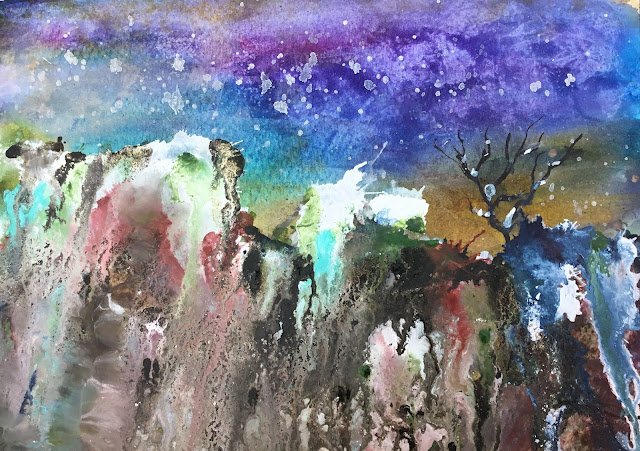
I thought a bit of watercolour painting was overdue, so I’ve been out there this morning running off this little number. The thunder started as I was wetting the paper at the beginning and it was a race against time to get it finished before the heavens opened. I just about managed to get there in time, although I had to put it in the wooden playhouse to dry.
Without any particular plan on mind, I thought I’d have a go at another random landscape. But I can’t just keep doing the same thing over and over again, so I came up with three experiments.
The first was to use some of that Daler-Rowley pthalo blue that’s still sitting around in the old takeaway carton that I use for my tubes. As Prussian blue (another cool, greeny blue) worked so well with Indian yellow and quinacridone magenta (in the “triadic left” key) I thought I’d try out pthalo blue with both of those colours. It’s an interesting threesome, of which the results can be seen in the sky, but I don’t think the greens and purples are as good as those with Prussian blue.
The second experiment was the debut for two new ink colours: titanium white and gold shimmer. The gold shimmer is different to my previous gold – it’s like a gold shimmer in a colourless solution rather than gold shimmer in gold solution. The jury’s out on the gold for now but the titanium white is already interesting. It’s very opaque and unfortunately (like waterfall green) doesn’t granulate well. It will be good for snowy scenes. But I can’t make the same mistake again as I made here: the white needs to be applied separately from all other colours otherwise it mixes with them to form something looking like melted ice cream. And if there’s brown in there or a number of different colours, it turns to chocolate ice cream mud, not just in colour but also in properties – looking at the drying painting from the side I can see hills of mud.
The third experiment was blowing. I’ve seen YouTube videos where people blow paint around gently using drinking straws. But rather than drinking straws, I was using the plastic tubes from the middle of rolls of dog poo bags. They’re wider than drinking straws and it meant that I needed to go for quick sharp blows rather than slow gentle ones. It had a great effect on the ink, resulting in explosions wherever I wanted them. I’m going to try this again another time but without mixing white ink with other colours – with white ink there it tended to mix up ice cream too often.
I thought the pthalo blue/quinacridone magenta combination would make for a great night sky, so should really have spattered on some stars using masking fluid but forgot and wet the paper without thinking. If the sky hadn’t already thundered, I’d have waited for it to dry, then spattered the masking fluid but I didn’t have the time for that. I’ll have to do a night scene with pthalo blue another day. Doing things another day is becoming a common theme with this painting.
The foreground with my three primaries looked good but has since been covered up with inks. I tried a wet into wet tree line in the background but couldn’t get it to work so was happy to see that inked over. The sepia ink tree on the right came out well but has been spoilt a bit by having too much snow added to it. The inky hillsides are starting to grow on me. I thought they might suffer from the ink runs all being too parallel and vertical but I can now see that those vertical runs are not parallel, coming closer together near the top, making the hillside look tall and the viewer feel small. In terms of granulation, the sepia ink is looking far superior to all others. The titanium white and waterfall green need blowing to get them to do anything interesting.
I spattered some titanium white over the sky not really knowing whether it was supposed to be snow or stars. I can tell you now that it’s snow. The clouds that I lifted out of the sky with kitchen paper actually look more like stars. There’s also an interesting area on the left where the inks are a bit smeared. That’s where the painting nearly fell off its perch while drying and I caught it and ended up with ink all over my hand. Looks OK though.
Overall, I think this is pretty good. There are bits of ambiguity there: faces in the cliff face and a tree that could be a stag. There’s a cold, ghostly feeling to it all, which is why I’ve named it after an Algernon Blackwood ghost story. Blackwood’s best stories are nature based, leaving you scared of the snow, the trees, the wind, the sand, whatever. I get the same feeling from this painting.
It’s up for sale. To see the price, click here.


Leave a Reply