The 2019 collection has started early! This one's called Derek's Dinner after I got the…

The Frankenstein-Dracula Variation
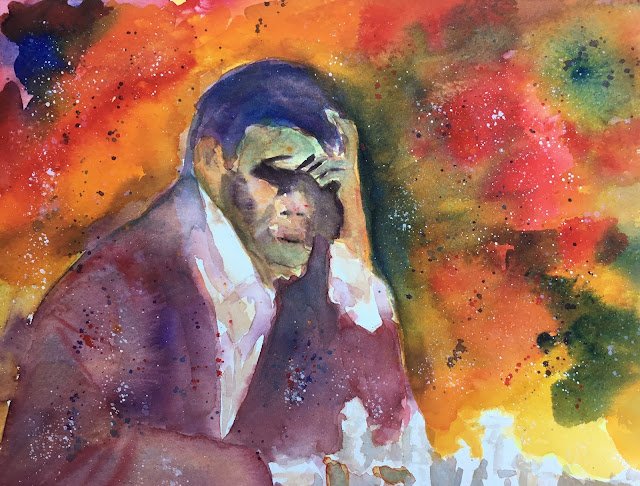
After reading Painting By Design by Charles Reid, I felt ready to attempt my first watercolour portrait. It started off as the world chess champion Magnus Carlsen but ended up looking like Dracula. So I’ve called it the Frankenstein-Dracula variation, named after the line 1. e4 e5 2. Nc3 Nf6 3. Bc4 Nxe4 in the Vienna Game.
I’m still checking out the experimental palette and didn’t hold back on the colours today. There’s transparent yellow, yellow ochre, Winsor orange, Winsor red (fast becoming a favourite), cerulean blue, French ultramarine, Winsor violet, Ivory black, Chinese white and titanium white (after the Chinese didn’t show up well in the spatters). With Winsor orange being the main yellow and Winsor red the main red, this is in the key of either orange warm or orange cool as the cerulean and French ultramarine blues both have significant parts to play.
I took on board lots of Charles Reid’s ideas. There are shadows on the face that blend into shadows on the hand and then into the jacket. The sharpest edges are around the right of the face (from our point of view) where I want the viewer’s attention to be. There were attempts at fuzzy edges – I like where colour has leaked out of the back of the jacket into the background. I deliberately darkened the background next to the hand to get a value contrast. In the jacket, I tried to bring some bits forward by adding red and pushing bits back by adding cerulean blue. And in the face, I used more red in the nose, cheeks and ear and more blue in the forehead, lower face and side planes. And the spattering at the end was a very Charles Reid thing to do.
And I quite like it. The best bit about it is the jacket, being one big, interesting shape, while still being recognisable as a jacket. It’s a pity I didn’t make the hair the same colour as the jacket and join them together into a single shape – that would have been good. And, still on the hair, there are no passages connecting the hair to the face, which isn’t great. I did manage to link the hair into the blue in the background though. And that sharp edge between the hand and the background does attract the eye. Not sure I can still call it a portrait though.
It’s up for sale. To see the price, click here.


Leave a Reply