


Time for another book review. This one's only been in the shops for a couple…
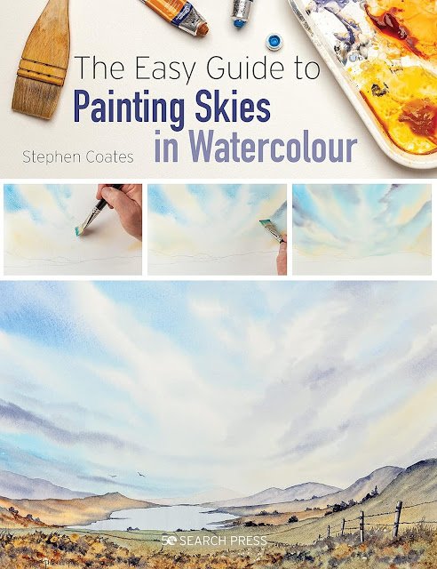
The Easy Guide To Painting Skies In Watercolour, Stephen Coates – Book Review
There seem to be quite a few books around on watercolour skies at the moment, all of them looking like they might include some interesting ideas. The problem is that so many of them are aimed at female artists. I’m thinking in particular of books by Rachael Mae Moyles and Zaeena Nabeel. Look them upon Amazon and tell me whether a male artist wouldn’t feel a tiny bit weird being seen with one of those books. Look further down the page at recommendations of similar books and you’ll see that there are loads of books like this: it’s not just skies. All seems very strange to me. Oh well. Their loss.
Anyway, somewhere in there I found this book by Stephen Coates. It’s a 112 page paperback devoted to painting skies. While I wondered whether it might be aimed at more inexperienced artists than me, I was still tempted, suspecting that this book might still have things to teach me. It’s not as if my skies are perfect. So I added it to my wishlist and it arrived in Christmas morning.
We have about 30 pages of generalities, 65 pages of specifics (including demonstrations) and 20 pages of closing generalities. A decent sounding structure to start with.
Let’s start with those first 30 pages. Often I’m bored by these pages, rolling my eyes at the vague musings and all the padding about equipment, but I found this book to be pretty well focussed. The bits about equipment are mercifully brief. Stephen recommends using expensive paper and cheap paints. He gives good reasons for why to use expensive paper for the skies in this book, so rather than saying that I’d go the other way and recommend cheap paper and expensive paints, I think I’ll recommend expensive paper and expensive paints. But there’s also lots of other useful stuff in there about how to hold a brush and how with watercolour skies you need to get the paint down quickly, back off while it does its thing, and be prepared for potential fails.
I do like Stephen’s choice of colours in this book too. Cerulean blue, French ultramarine, light red, burnt umber, burnt sienna, raw sienna, lemon yellow and Payne’s grey. Light red is mainly used to create a plum coloured mix with the French ultramarine and I reckon I could do this with rise dore instead. And I could substitute transparent yellow for the lemon yellow, but otherwise these are all colours that I’m very happy to use. I’m finding myself wanting to give the burnt sienna and burnt umber some action in January. It was a pleasant surprise not to see cadmium red and cadmium yellow all over the place in the sunsets.
Talking of sunsets, we then get on to the meat of the book with the six types of sky. These are:
– plain simple top to bottom graduations
– white clouds
– sunsets
– sunbursts
– stormy skies
– low clouds and mist
I think this is a pretty comprehensive list of skies. For some of these skies, Stephen describes lots of different techniques but also gives advice on the pros and cons of different techniques: he doesn’t hold anything back. I learned plenty in this part of the book and was especially excited by the choice of colours in places and am looking forward to giving some of these ideas a go.
And then we get to the closing generalities. First there’s some stuff about using clouds to point to focal points and to imply depth. In the contents page of the book, this bit is presented to us as a seventh type of sky, but I see it as a closing generality. The rest of the closing section talks about artists developing a repertoire of sliders and not being afraid to use the same sky in multiple paintings, which makes sense. And then we’re at the end of the book. So what did I think of it?
First of all, I see the book’s very existence as a positive. The world needs a book on watercolour skies that doesn’t look like it’s aimed at Disney princesses. As for the content, yeah, it’s pretty good. It covers lots of different skies and includes lots of ideas. Some of those ideas aren’t restricted to skies, as the demonstrations include foregrounds and birds, and there’s stuff to learn there too. I think the biggest takeaway from this book for me personally, though, was a new appreciation of skies. I’ve not thought about skies for ages but am now thinking about them as an integral part of the while painting and something to be planned carefully. And I think I’ll be more patient in future, allowing skies to just do their thing as they dry and to not interfere – an approach that I used tongues when I first started but have drifted away from. So that’s a big lesson for me. And the other big plus, as I said before, was Stephen’s use of colours.
Could anything have been done better? Well, 112 pages is a bit short and I’m wondering whether this book could have been extended to 128 or 144 pages with some stuff about names of types of cloud, or whatever, but that’s being pretty pedantic. And the other thing is that this book felt a little simplistic. I felt a little guilty reading something that a complete beginner might also find to be of value. This feels like an unfair criticism, though, as I’m usually a big advocate for keeping things simple so that anyone can understand what’s being described.
Anyway, my mind’s made up. This book included enough ideas to definitely worth the money, but not enough ideas for me to be able to call it a “really good book”. So it gets three palettes which, I must remind you all, is a good score. I think this is one of the stronger three palette books and it may well be possible that I might have given it four palettes had it been around much earlier in my watercolour journey.
🎨🎨🎨
You can find this book and more reviews of it at Amazon UK here. As an Amazon Associate, I earn commission from qualifying purchases but this costs absolutely nothing extra to you.
Leave a Reply