Right, enough messing about. I really should be doing more watercolour painting. I had an…

The Cities Were Abandoned And The Forests Echoed Song
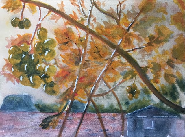
It’s been a bad day at the office today. I wanted to use some of the lessons I learned the other day after sorting my paintings by colour key. I looked through my folder of painting ideas and found an autumnal photo of some vines against a foggy background that I’m guessing was a BBC news stock photo for wine-related stories. I thought that this having lots of orange in it but no blazing sun would work well in the key of orange cool, so my three primaries were Prussian blue, Indian yellow and rose dore.
I drew the scene in pencil first. This was a mistake for two reasons. First, I should only have added the drawing after the underpainting (otherwise it’s too hard to see the pencil marks) and, second, I shouldn’t have drawn in leaves to colour in: I’d have been better off adding fairly random leaves.
Anyway, the underpainting went down next, including the wall and buildings. I messed up here as well. 8 sjhpuld have put down the wall and buildings and then followed up with the fog. Instead I did them both together and the wall and shed just don’t look like there’s much fog in front of them. Any way, the background started off as quite neutral colour. While it was still wet I sprayed some water on it, then spattered in the three primaries and tipped the watercolour block around a bit. I wasn’t getting much exciting stuff going on, so I must admit I did mix in the primaries by brushing over.
And then everything else was added in glazes. I couldn’t see much of my drawing, so this didn’t come out anything like as good as I’d planned. First I put down. Indian yellow for all the leaves, grapes and branches. Then I added the rose dore to the branches and most of the leaves. Finally I added Prussian blue to the grapes, the branches and just a few of the leaves. After that, I did a load of tinkering. I put Prussian blue into the darkest shadows on and neap between the grapes, negatively painting the grapes in places. I went over all the grapes with a thin, unifying, green glaze and all the branches with a thin, unifying neutral glaze. I tried some extra yellow glazes around the left of some of the grapes in an attempt to make them look more three-dimensional.
It was all to no avail, really. I ended up with the clunker that, to be honest, I deserved. I did one last bit of tinkering, adding highlights to most of the grapes, some of the branches and the foreground shed in titanium white. It took two coats to get them white enough and they do make the grapes look three-dimensional but I find the white a little stark against the colours behind it.
I suspect I may have been moderately happy with this a few years ago but not now. It’s not going up for sale. With no decent Blackwood story names or Hendrix song titles springing to mind, this one takes its name from some Rush lyrics. RIP Professor Peart.


Leave a Reply