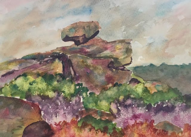
30 October 2013 Here are some rocks. The painting is based on a photo of…

The Brimham Rocks
Today’s subject is The Brimham Rocks, a rock formation somewhere near Harrogate in North Yorkshire. My rocky paintings have been pretty good this year and I thought I’d build on that by continuing to paint colourful rocks but also making the surrounding heather more colourful.
The main three primaries were cerulean blue, quinacridone magenta and transparent yellow, so this is in the key of green cool. Viridian and burnt sienna are the extra herbs that make things more interesting in places – burnt umber isn’t getting much of a look in these days. Prussian blue and Winsor red were used to mix up some darks for shadowy crevices and the Prussian blue was also used in the distant background and some of the green and purple heather.
The sky was first to go on. I started with cerulean blue, then dropped in burnt sienna, viridian and a little quinacridone magenta. I was careful to make the sky light enough around the top rock to make that rock pop out. I’m really enjoying my skies this year.
Next was the distant background. I had many attempts but never really got the colour right. And it’s too big for such a monotone area.
Then came the rocks and the shadows. I’m very happy with the colours in the rocks, which I allowed to mix on the paper rather than mixing in the palette. The shadows aren’t great though. In some places thy went on first, in other places last, but they’re too dark everywhere and too hard edged.
Finally, the heather went on. I has some fun with this, playing it loose, dabbing on random splotches in three bands of green, purple and orange. In all three cases, two primaries were dabbed on separately and allowed to mix on the paper. At this stage I spotted a problem: the values of the rocks and heather were too similar, so something needed to be done to contrast them. I started by throwing on some salt to change the texture of the heather. It started to make patterns while the paint was still wet, so I thought I’d try dabbing that paint off with a paper towel before it dried. And I ended up with what a I have to say are some interesting results!
Overall, I think this goes down as a flop. The ugly shadow in the bottom left, the hard edged shadows generally, the boring distant background, the lack of value contrasts. This one’s not going up for sale.
And I need to start doing paintings properly by starting with a value sketch.


Leave a Reply