It's all go at the moment. We've got someone coming in on Tuesday to replace…
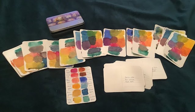
The Big Swatch
After settling on a palette with three reds, three blues and three yellows (counting raw sienna as a yellow), I was keen to produce a new set of triplet swatches. This is something I did last year, looking at the eight possible combinations from two reds, two blues and two yellows. Checking out the secondary colours that I could get from them and the neutral colours that I could get from mixing all three. This time, though, there were 3*3*3=27 swatches needed and I decided to also include viridian in each swatch, looking to see how it mixed with the red.
I took a look in Ken Bromley’s internet art shop for watercolour journals. Something with slightly over 27 pages would be a convenient way of carrying my swatches around. I didn’t find a suitable journal but I did find an interesting set of postcards made of watercolour paper. There were 30 in the tin, so three spares in addition to the 27 I needed and the6 came in a cool looking tin to carry them around in.
So I’ve been busy this afternoon, taking my time over those 27 swatch cards. They all have paint on one side and the names of the colours on the other side where there are lines to fill in addresses. There’s more space on that side of the card where I may end up making notes or listing the paintings that use that combination.
I messed up the colour names on one card and used one to swatch all twelve colours separately so have one card spare. I think I’ll use this tomorrow, redoing one of the cards that came out looking a bit too messy.
I’ve never seen other artists doing swatches like this: the furthest they ever seem to go is to do grids of all the pairs of colours in their palette. But what good is this in helping choose what three primaries to use in a painting? Surely my triple swatches are the best planning tool?





Leave a Reply