Time for something new. This has been brewing away in my mind for a couple…

The Allman Brothers Band
An idea came in the night to me. It was to use inktense pencils to draw some sort of skyliney landscape but negatively, leaving trees and buildings white but only colouring part of the sky around the edges. Part of the building could be coloured but only if there was something like a tree in front of it, in which case the only bit of the building that was coloured would be the but just around the edge of the tree. The subject of the landscape could my house, or maybe a Cambridge college.
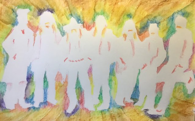
Anyway, that was the dream. I deviated from it on all sorts of ways, starting with the subject. I couldn’t find a good landscape subject, so I went instead for a photo of The Allman Brothers Band. The photo is from the early 90s and looks like it’s from the same photo session as the covers on the First Set and Second Set albums. From left to right we have Jaimoe, Allen Woody, Dickey Betts, Greg Allman, Warren Haynes, Marc Quiñones and Butch Trucks.
I started off the way that I was expecting my landscape to work. I just went randomly around the outline of the one big shape using all my brightest colours: sherbet lemon, sun yellow, tangerine, poppy red, chill8 red, fuchsia, violet, bright blue, iris blue,vsea blue, teal green, field green and apple green. I then deviated from my plan a bit by filling in the gap between these pencils and the edge of the paper using Earth colours: mustard closest to the colours, then baked Earth and finally willow at the edge of the paper.
Then I added the water. With such a big area to cover, there was the danger of paint drying too quickly for the whole shape to work together. So I watered it in outwardly radiating stripes. I painted in one set of alternating stripes, then filled in the gaps. I think they work.
Then I looked at the painting and thought that the white shapes looked too white and underworked. So I decided to add some quite faint details, I started with any facial hair or any long hair that wasn’t touching the edges. This I did using the yellowish colour that was in my still wet brush. I then added some faint lines to this in poppy red and, still not entirely happy, then added some random things like belts, hands in pockets and trainer decorations, which was just enough to make these white shapes start looking like people.
It’s possible in a painting like this to actually get some good likenesses. The three in the middle look pretty good to me.
Overall, I rate this one as successful and am putting it up for sale. To see the price, click here. The craziness of the idea, the radiating lines, the likenesses and the subtlety of those marks in the figures all seem to work. It’s good to do something different with the inktense pencils once in a while.


Leave a Reply