


This week I've been thinking about the colours in my watercolour palette. My 2022 palette…

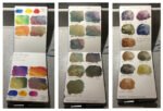
The 18-Colour 2022 Palette
My second job was to load up the Mijello palette that I got for Christmas. It roughly follows colour wheel order but I’ve been careful to save the triangular corner plots for my three opaque colours (so I remember they’re opaque and don’t use them where I want to use transparents) and for burnt umber, which is looking like becoming my least used colour. If I go off any of my three new Daniel Smith colours, burnt umber will be moved to a transparent slot and Payne’s grey recalled to take a corner plot (being opaque).
So, starting top left and going anti-clockwise, I have:
– transparent yellow (cool, transparent yellow)
– raw sienna (cool, transparent yellow but earthier)
– Indian yellow (warm, transparent yellow, dual pigment but works for me)
– cadmium yellow (warm, opaque yellow for spatters and for wet into wet if I don’t want the yellow spreading)
– cadmium red (warm, opaque red for spatters and for wet into wet if I don’t want the red spreading)
– rose dore (warm, transparent red, dual pigment but works for me)
– Winsor red (warm red, only semi transparent but a really red red, like the cadmium)
– quinacridone magenta (cool, transparent red)
– hematite violet genuine (granulates into pink with black spots, a wild card)
– French ultramarine (warm, transparent blue)
– cerulean blue (cool, light blue, only semi transparent but there for it’s granulating effects). I need to buy some more of this!
– Mayan blue (another cool blue there for granulation effects, a wild card)
– Prussian blue (cool, transparent blue)
– burnt umber (a transparent brown)
– sepia (an opaque black/brown, there for wet into wet I don’t want the brown spreading)
– burnt sienna (transparent reddish brown)
– green apatite genuine (green that granulates into red/brown and green, a wild card)
– viridian (transparent blueish green, there to add a green tinge to sky or water or to make fatks when mixed with reds)
With the viridian being the bluer of the two greens, maybe I should have put the two greens the other way round.
Titanium white remains part of my plans. It’s not in the palette because I prefer to use it straight from the tube with no risk of cross contamination. And looking through my plastic takeaway tub of spare tubes, I also have cobalt blue, Payne’s grey, light red and (Daler & Rowney) pthalo blue available if required.
Leave a Reply