


All my artwork, good or bad, goes up on this website. That's why I'm showing…
Take You Me For A Sponge?
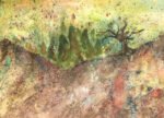
Something different today, a watercolour painting painted mainly using sponges. It’s a view in Queendown Warren, chosen for the many layers of greenery, making it appropriate for a sponge painting. The main colours used were French ultramarine, transparent yellow, raw Sienna, dore fire, burnt Sienna and burnt umber. With these all just about qualifying as warm blues, cool yellows or warm reds, this one is in the key of triadic right. Cadmium yellow, cadmium red and white gouache came in for cameo roles at the end.
I started at the back of the painting (the sky) and worked my way forward, trying to make the colours darker with each successive layer. The main tree, the middle ground treetrunks and the pathway were all painted in using a brush but everything else was applied with a sponge. I was surprised by the amount of paint that I needed to mix and at how thick I needed to mix it.
Towards the end, I felt that the painting was lacking colour. I tried sponging on more of the rose dore and transparent yellow but they were both too transparent, so I had to use my favourite three opaque colours to save the painting. I started by dabbing in a bit of cadmium red, cadmium yellow and white gouache in the foreground and below the tree, all of them straight from the tube. It helped a bit but the painting needed more, so I dabbed in a lot more of the opaque colours, even using them in the greenery on the main tree and in the foreground trees. The horizon in my source photo was quite a bright yellow and this wasn’t coming through in my painting, so I brought it to life with cadmium yellow. Cadmium yellow might be opaque but it does have its uses and is one of my favourite colours when used sparingly at the end of a painting. Oh, and I applied some subtle diagonal sponge swipes to the bottom right corner. And that was me done.
There are a lot of subtle features to like about this one. The colours in the main tree trunk, the hints of diagonal lines in the bottom right pointing to the tree, the way the reds in the bottom right complement the greens in the rest of the painting, that bright yellow horizon, the way the rightmost middleground tree trunk looks like a strange man, the darks in the middleground trees, the spongy leafy textures on the trees and the impression of detail in the random bottom right corner. I’m a bit disappointed, though, by the darkness, the muddiness of the colours in the path and the horizontal boundary along the bottom of the greenery of all the middleground trees. All in all, though, this one’s definitely worth a place in the shop window. It’s up for sale, with the price to be found here.
And I’m naming this one after a quote from Hamlet.

Leave a Reply