


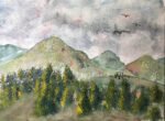
As I said in the last post, I felt like I could do a second…
Lula’s Spot
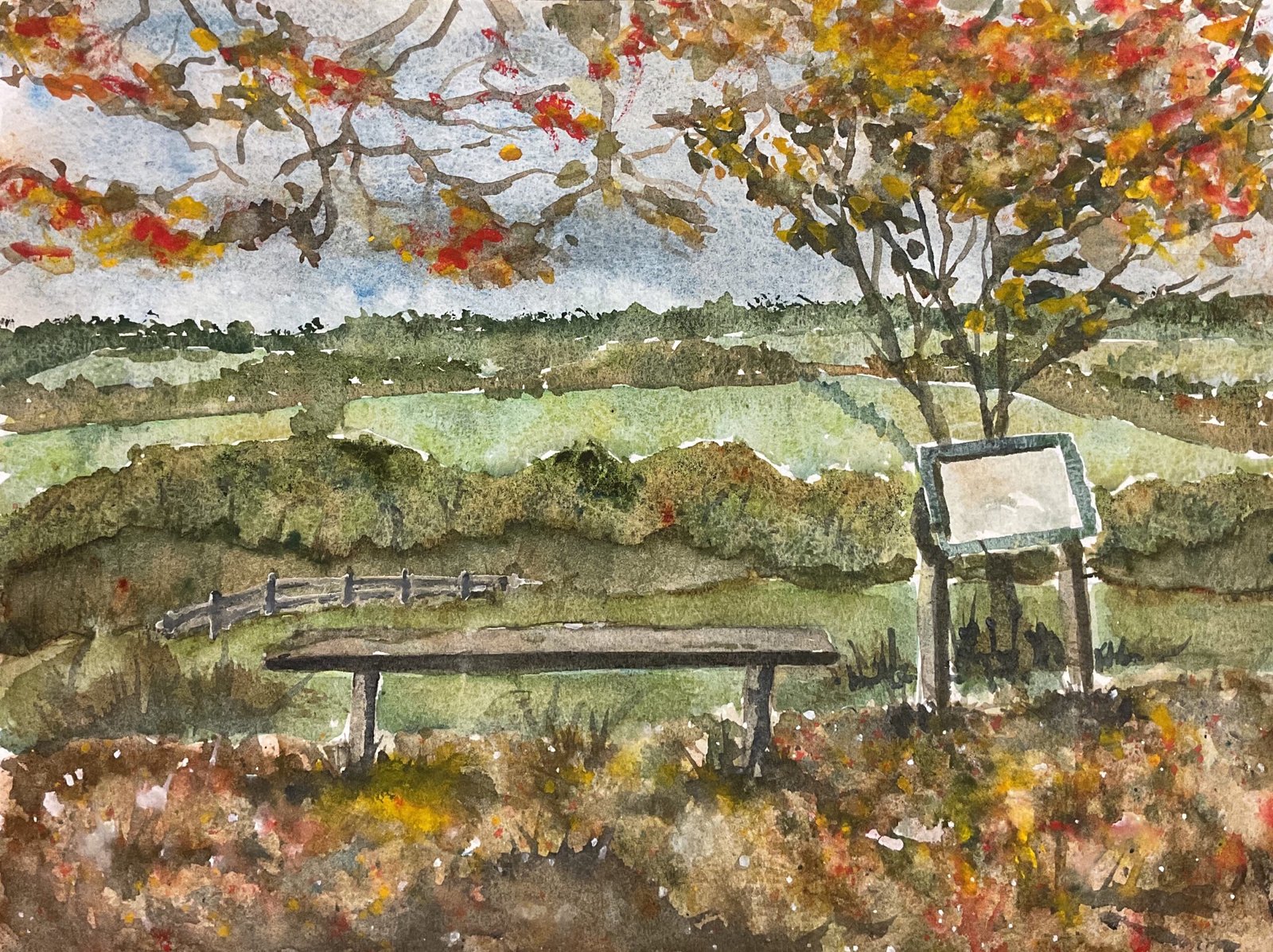
I’ve done another painting of Queendown Warren today. This isa bench that I walk past pretty well every day. If it’s been raining a lot, I go for a different walk instead, sticking to the roads rather than tramping overnight grass, which means a trip to the local farmshop in Stockbury. Quite often, maybe a couple of times a week, I’ll bump into a local guy in his eighties Sittingbourne this bench. I don’t know his name but I do know the name of his dog. It’s Lula. She’s deaf and almost blind and barks at everybody except me, who she’s all over instead.
I saw this as a chance to have another go with the Shire supergranulators. They’re interesting colours but they’re so needy! They need a blue for the sky, so I used cerulean blue. The greens are quite light and great for rolling hills but hopeless for trees, so I need some darker greens: I used green apatite genuine and forest brown. They need some red or brown for warmth: I used burnt sienna. And they need some opaque colours to bring the foreground closer: I used cadmium yellow, cadmium red and sepia. There were also appearances for tundra orange, titanium white and white gouache. That makes fifteen colours in all! It’s a lot but every colour was chosen for a reason and it wasn’t just to match the colours that I could see (which is a sure fire way to ruin a painting in my opinion).
The first colour down was the sky. There’s cerulean blue, Shire grey and burnt sienna in there, with some interesting granulation going on.
Next I went for the light hillsides, using Shire blues Shire green, Shire olive and Shire yellow. I also included burnt sienna to calm the greens down a bit. I used more of the brown closer to the front and more of the blue towards the back.
After the hillsides came the tree lines. I used green apetite genuine and forest brown with a bit of burnt sienna and dropped in a little of the other Shire colours.
Then it was the bench and sign, I found that Shire grey, Shire blue and burnt sienna made for an interesting neutral colour.
After that came the foreground where I started with several layers of stabby, leaf-like shapes in all sorts of colours.
Finally I added the tree behind the sign and the overhead branches, again using all sorts of colours.
And then there came a lot of tinkering including:
– using the titanium white trick on the set of the bench to lighten it and add a bit of texture
– adding the fence, first in white gouache, then darkening the shadow sides
– adding a bit of colour to the overhead leaves with stabby, leafy marks in cadmium yellow and cadmium red and dabbing paint off quickly with kitchen paper so that the opaque colours didn’t overpower everything
– adding more layers of stabby leaf shapes over the foreground, including cadmium red, cadmium yellow and sepia this time, again dabbing with a kitchen towel to prevent the opaques from taking over
– adding grasses and little hillocks in the foreground using whichever dark colours felt right
– spattering cadmium yellow, cadmium red, sepia and white gouache over the foreground while covering up the rest of the painting
And that was me pretty well done.
I think this painting was a success. With a little help from their friends I got the Shire supergranulators to work. My main two niggles are the green shape behind the fence, which I could have done without, and the mess in the top right where overhead branches are indistinguishable from the tree behind the sign. The green and orange colours work well together as complements. I’m not a great fan of these green/orange paintings but that’s my personal taste and not me doing myself down. Because I know there are people out there who will love these autumnal colours and the way they complement each other. What with this also being a local painting, I wouldn’t be surprised if it sold quickly but we’ll see.
And, what do you know, this one sold within a couple of hours to another actuary.
Leave a Reply