


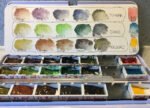
So it's my birthday and I've got a lot of new art gear. Jeepers. So…
Supergranulating Swatches
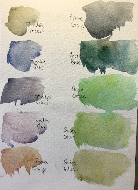
Before having my first go with the shire supergranulators, I thought I’d swatch both of my supergranulating sets. This is in the back of an old painting; I think it’s on cold pressed (aka not) paper.
First there’s the tundra set:
– tundra green is a mix of pthalo turquoise and Mars brown
– tundra blue is a mix of French ultramarine and raw umber
– tundra violet is a mix of French ultramarine and Mars brown
– tundra pink is a mix of French ultramarine and potters’ pink
– tundra orange is a mix of yellow ochre, potters’ pink and raw umber
These all look great in the swatches, with the pink and violet being especially interesting. From experience I already know the orange to be a brown with low tinting strength. The green is quite a dull one but has its uses; I just need to remember to not use it for trees, for which it doesn’t work.
In my supergranulating palette, I have these five colours supplemented by transparent yellow, the two ideas being that yellow is opposite violet and that transparent yellow, being cool, might have a chance of creating some greens that could work with trees. After trying this out once, I now know that cadmium yellow might be a better choice, with its opacity being key to making greens stand out.
Then there’s the shire set:
– Shire yellow is lemon yellow deep plus (maybe) ultramarine violet
– Shire olive is lemon yellow deep plus cerulean blue
– Shire green is lemon yellow deep plus viridian
– Shire blue is lemon yellow deep plus French ultramarine plus cobalt green deep
– Shire grey is lemon yellow deep plus cobalt blue deep plus Mars black
The colours all look interesting, although it’s missing a good sky colour, the olive and green are a bit in your face (so maybe needing a red to neutralise them) and it’s just all very green, with the blue and the yellow bath bordering on green. It’s going to be difficult to get these to work without involving extra colours.
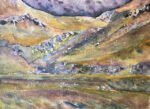
In my supergranulating palette, I have these supplemented by rose dore, a warm red that will complement and maybe neutralise a very green collection. I’ve found that this works as you’ll see in my next post.One thing the two sets have in common is that they seem to need some help from opaque colours to make shapes stand out from each other, so cadmium red, cadmium yellow, titanium white and sepia will see a bit more action than they have done before. As for the palette that these tins are stored in, the rose dore is definitely worth its place but the transparent yellow could be replaced with cerulean blue just to give me something I can paint skies with. While the five tundra colours can probably stand alone (with maybe a bit of help from opaques), the shire set does need to be supplemented by a red and a sky blue as well as not being averse to some opaque intervention.
At this stage I’m preferring tundra to Shire.
Leave a Reply