


I'm currently reading How To Make A Watercolour Paint Itself by Nita Engle and thought…
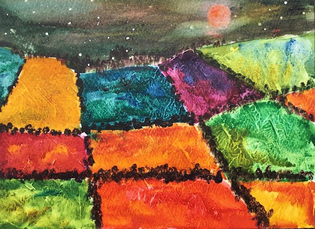
Super Blood Wolf Moon
Today was going to be about bright colours. I was still in my orange fixation but was also wanting to give the viridian another good workout. I decided the was to do this was to make viridian and my six transparent primaries the stars and to prep my paper with gesso. That sounds to me like the way to get the most vibrant colours imaginable. Of those seven colours, five are single pigment, rose dore and Indian yellow being the two exceptions. With all six primaries starring, I can’t claim to have painted this one on a single key.
The gesso went on last night. It went over most of the paper but leaving a band for sky at the top. Rather than painting it on, I spread it on with a palette knife and then did some pattety pats with the knife all over to get a bit of texture. And it’s a great texture – the green field on the right looks like a cabbage leaf.
With all six primaries in starring roles, I didn’t want any of them to steal the glory in a blue or orange sky or a sunset. And I definitely didn’t want to bring in Payne’s grey or raw sienna. So I went for a night sky using a dark colour mixed from three primaries – I think they were French ultramarine, quinacridone magenta and Indian yellow but can’t swear to it. I masked out the moon first and spattered on masking fluid for stars. Some paint got under the masking fluid on the moon, which is why I had to colour it in and how I got to a super blood wolf moon. As well as painting the sky in that dark colour, I charged in the three primaries in places for a bit of variety. I think I dropped in some Prussian blue too.
And then there’s the fields, with all the best oranges and greens I could think of and some other colours to make up the number. Left to right, row by row we have:
– viridian and Prussian blue with the green and blue also charged in
– Indian yellow with an imperceptible amount of rose dore charged in
– viridian and French ultramarine, both also charged in
– quinacridone magenta and French ultramarine with the French ultramarine charged in at the top
– French ultramarine and transparent yellow, both also charged in
– (second row now) rose dore with a bit of Indian yellow charged in
– rose dore and Indian yellow, both also charged in
– viridian and transparent yellow, both also charged in
– rose dore and Indian yellow
– (bottom row) Prussian blue and transparent yellow, both also charged in
– cadmium red (I was starting to run out of ideas) and Indian yellow, both also charged in
– Indian yellow, with more rose dore charged in than before
And then finally, it would have been easy for me to add all the trees and foliage around the edges of the fields in sepia but instead I used Prussian blue, rose dore and Indian yellow. I had to mix and use them pretty well direct from the tube to make them work. I felt like an oil painter.
Before I get to the denouement, a word about rose dore. Rose dore is struggling to hold its place as the warm (orangey) transparent red in my squad. Quinacridone red, which I’ve not yet tried out is putting it under pressure. The quinacridone has the advantages of being cheaper, single pigment and non-staining. I’ve heard that the quinacridone disappears pretty quickly as it takes a lot of paint to get to something strong enough to use. But I tell you what, that rose dore has exactly the same problem. Provided the quinacridone can make oranges as good as these rose dore ones, then it’s going to get a seat in the plane. Anyway, when the rose dore runs out, I’ll be giving the quinacridone red a tryout.
Anyway, I like this one. The colours in the sky are great and those on the landscape jump off the page. This was never meant to be a realistic painting, so there was no need for me to dull them down with a glaze over the top like I did with these sandstone pillars yesterday. And the gesso worked a treat, adding those cabbage leaf textures and making the colours zing. One downside for me is that I keep catching that patchwork of colours out of the corner of my eye is and they remind me of some bedding I used to have. The other is that this one could be accused of being derivative of the painting on the front of that Stephen Quiller book that is sitting second of third on my wishlist (I’ll accept partially derivative). Needless to say, though, this one’s up for sale.

Leave a Reply